

Or what to remember when developing a dark mode for an app or website
The year 2018 showed that dark modes are on the rise. Now that we are already halfway through 2019, we can confidently say: they are here, and they are everywhere.
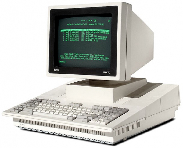
Let's start with the fact that dark mode is not a new concept. It has been around for quite some time. In fact, it was once the only option available: monitors displayed in 'green-on-black' because the phosphorescent coating inside emitted a greenish glow when excited by radiation.
But even after the introduction of color monitors, dark mode continued to exist. Why is that?
 There are two main reasons explaining why today half of the people are rushing to add a dark theme to their applications. First and foremost: computers are everywhere. No matter where we look, there's some screen. We use our mobile devices from morning until late at night. Having a dark mode reduces eye strain when you're in bed scrolling through your social media feed for the "last time" before sleep. (If you're like me, that "last time" can mean a three-hour scroll.) . Dark mode? Absolutely, please!
Another reason is the new display manufacturing technologies. Flagship models from major companies—Apple, Google, Samsung, Huawei—are all equipped with OLED screens that, unlike LCD displays, do not require backlighting. And that is indeed great news for your battery. Imagine you're viewing an image of a black square on your phone; with an LCD display, the backlight lights up the whole screen, even though a large part of it is black. But when viewing the same image on an OLED display, the pixels that form the black square simply turn off. Thus, they do not consume any power at all.
These types of displays make dark modes much more intriguing. By using a dark interface, you can significantly extend the battery life of your device. . Dark modes, of course, go hand in hand with UI changes, so let's refresh our knowledge!
Dark Modes 101
First of all: 'dark' does not equal 'black'. Do not attempt to replace a white background with black, as this will make shadow usage impossible. Such a design will be super flat (in a bad way).
It is important to keep basic shading/lighting principles in mind. Objects that are more elevated should be lighter in shadow, simulating real lighting and shading. This way, it’s easier to distinguish different components and their hierarchy.
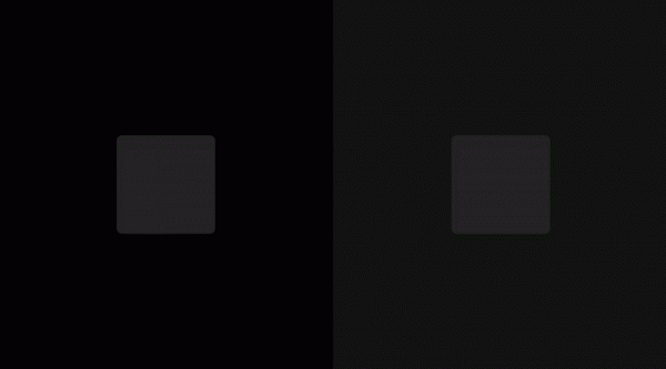
Two equally gray squares with shadow, one on a 100% black background and the other on #121212. When elevated, the object acquires a lighter shade of gray.
In a dark theme, you can still work with your usual primary color as long as the contrast is appropriate. Let’s explain this with an example.
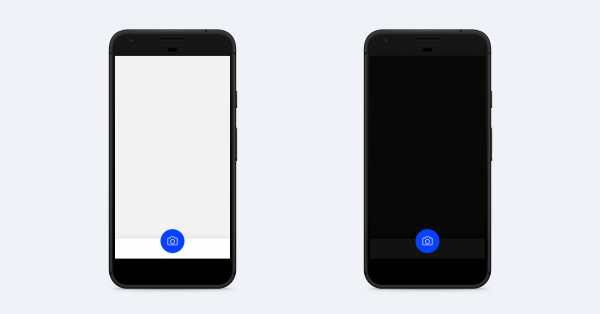
In this interface, the primary action is a large blue button in the bottom panel. There is no contrast issue when switching between light or dark mode; the button still attracts attention, the icon is clear, overall, it’s great.

When the same color is used differently, such as in text, there will be issues. Try using a (much) less saturated shade of the primary color or look for other ways to incorporate brand colors into the interface.
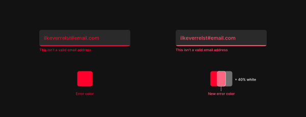
Left: red on black looks bad. Right: let’s reduce the saturation — and everything looks good. — Translator’s note.
The same goes for all other saturated colors you might have used, such as warning or error colors. Google uses a 40% white overlay on top of the default error color in its when switching to dark mode. This is quite a good starting point, as it will enhance contrast levels to meet AA standards. Of course, you can always adjust settings at your discretion, but don’t forget to check contrast levels. By the way, a useful tool for this purpose is a plugin for Sketch — , which accurately shows how much contrast is between two layers.
What about text?
It's simple: nothing should be 100% black on 100% white and vice versa. White reflects light waves of all lengths, while black absorbs them. If you place 100% white text on 100% black background, the letters will reflect light, blur, and become less readable, negatively impacting readability.
The same goes for a 100% white background, which reflects too much light to fully concentrate on the words. Try softening the white color a bit; use light gray for backgrounds and text on black backgrounds. This will reduce eye strain, preventing
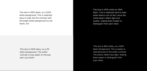
The dark mode isn’t going anywhere.
The amount of time we spend in front of screens is constantly increasing, and every new day brings new screens into our lives, from the moment we wake up until we fall asleep. This is quite a new phenomenon; our eyes are not yet accustomed to such an increase in screen time late at night. This is where dark mode comes into play. After its introduction in macOS and Material Design (and likely in iOS), we believe that sooner or later it will become the default in all applications, both mobile and desktop. And we better be ready for it!
The only reason not to implement dark mode is if you are absolutely 100% sure that your application is used exclusively in bright daylight. This is quite rare.
There are a few things worth mentioning that will require special attention when implementing dark mode, aside from the basic principles summarized earlier.
From an accessibility standpoint, dark mode is not the most user-friendly, as the contrast is generally lower, which in turn does not improve readability.
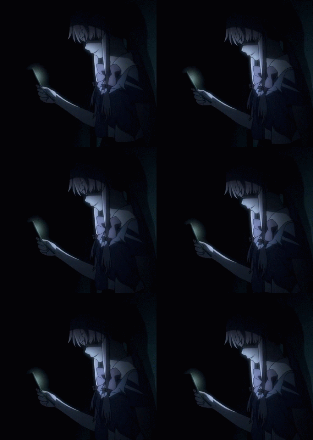
But, imagine that you are getting ready for bed, feeling very sleepy, but just before falling asleep, you remember that you need to send someone a super important message that can't wait even one night. You take your phone, turn it on, and AAAAH… the bright background of your iMessage will keep you awake for another 3 hours. While bright text on a dark background is not considered maximally accessible, having dark mode right at that moment would increase convenience by a million. It all depends on the situation the user is in at that moment.
That's why we believe automatic dark mode such a cool idea. It turns on in the evening and turns off in the morning. Users don’t even have to think about it, which is very convenient. Twitter did a great job with the dark mode settings. Furthermore, they have both a standard dark mode and an even darker mode for all those OLED screens, battery saving, and everything related. It's important to note: give users the option to toggle it manually when they want to; there's nothing worse than an automatic interface switch without the ability to revert.
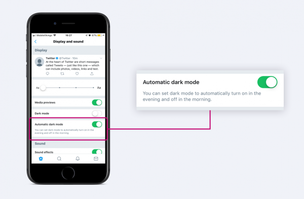
Twitter has automatic dark mode that turns on in the evening and turns off in the morning.
Also, when designing themes, it's worth considering that some things simply cannot be made dark.
Take a text editor, for example, Pages. You can make the interface dark, but the actual sheet will always be white, resembling real paper.
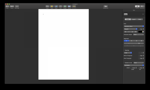 Pages with dark mode enabled
The same applies to all types of content creation editors, like Sketch or Illustrator. Although the interface can be made dark, the working canvas will always be white by default.
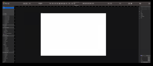 Sketch in dark mode and still a bright white working canvas.
Therefore, regardless of the application, we believe that dark modes will become native to your operating system, so it's best to prepare for the future in advance. it will be dark.
If you want to learn more about designing dark interfaces, be sure to check the guidelines , which was our main source of information for this article.
Source: habr.com
