

A few words about the "golden ratio" in its traditional sense
It is believed that if a segment is divided into parts such that the smaller part relates to the larger part as the larger part relates to the whole segment, this division gives a proportion of 1/1.618, which the ancient Greeks, borrowing it from even older Egyptians, called the "golden ratio." And that many architectural structures – the proportions of building outlines, the relationship between their key elements — from the Egyptian pyramids to the theoretical constructions of Le Corbusier — were based on this proportion.
It corresponds to Fibonacci numbers, whose spiral provides an expanded geometric illustration of this proportion.
Moreover, the dimensions of the human body (from the soles of the feet to the navel, from the navel to the head, from the head to the fingers of the raised hand), starting from the ideal proportions seen in the Middle Ages (Vitruvian Man, etc.) and ending with anthropometric measurements of the population of the USSR, are quite close to this proportion.
If we add that similar figures are found in completely disparate biological objects: shells of mollusks, arrangements of seeds in sunflowers, and in cedar cones, it becomes clear why the irrational number starting as 1.618 has been declared "divine" — its traces can even be tracked in the shape of galaxies gravitating towards the Fibonacci spiral!
Considering all the aforementioned examples, one can assume:
- we are dealing with truly "big data,"
- even at first glance they indicate some, if not universality, then an extraordinarily wide representation of the "golden ratio" and values close to it.
In economics
Lorenz diagrams are widely known and intensively used for visualizing population income. This powerful macroeconomic tool, with various variations and clarifications (decile coefficient, Gini index), is used in statistics for socio-economic comparisons between countries and their characteristics and may justify large political and budgetary decisions in the areas of taxation, health care, and the development plans of countries and regions.
And although in normal everyday consciousness income and expenses are closely linked, this is not the case in Google... Surprisingly, the only connections I found between Lorenz curves and expense distribution were in the works of two Russian authors (I would appreciate any tips on similar works in both Russian and English sectors of the internet).
The first is the dissertation by T. M. Bueva. The dissertation specifically addressed optimizing expenses in Mari bird farms.
The other author, V.V. Matokhin (mutual references between the authors exist), approaches the topic on a broader scale. Matokhin, a physicist by initial education, deals with statistical data processing used in management decision-making, as well as assessing the adaptability and manageability of companies.
The concepts and examples presented below are drawn from the works of V. Matokhin and his colleagues (Matokhin, 1995), (Antoniou et al., 2002), (Kryanev et al., 1998), (Matokhin et al., 2018). In this regard, it should be added that any possible errors in interpreting their works are solely the responsibility of the author of these lines and cannot be attributed to the original academic texts.
Unexpected Constancy
Reflected in the graphs presented below.
1. Distribution of grants under the scientific and technical work competition of the State program 'High-Temperature Superconductivity'. (Matokhin, 1995)
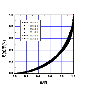
Fig. 1. Proportions in the annual distribution of funds for projects from 1988 to 1994.
The main characteristics of the annual distributions are presented in Table 3, where SN is the annual amount of allocated funds (in million rubles), and N is the number of funded projects. Considering that during these years the personal composition of the competition jury, the competition budget, and even the scale of money (before and after the 1991 reform) changed, the stability of the actual curves over time is astonishing. The black stripe on the graph consists of experimental points.
| 1988 | 1989 | 1990 | 1991 | 1992 | 1993 | 1994 | ||
| S | 273 | 362 | 432 | 553 | 345 | 353 | 253 | X |
| Sn | 143.1 | 137.6 | 136.9 | 411.2 | 109.4 | 920 | 977 | Y |
Table 3
2. Curve of expenses related to the sale of commodity stocks (Kotlyar, 1989)
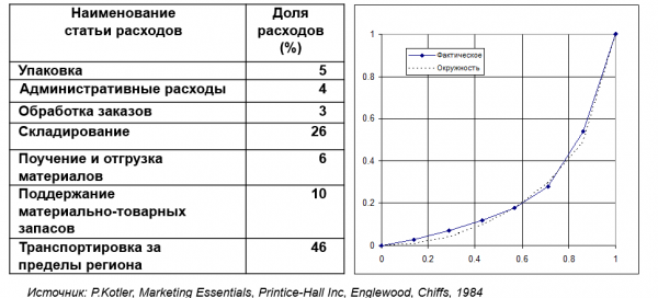
Fig. 2
3. Salary scale by rank
As an example for constructing the diagram, data from the document 'Statement: how much is to be allocated to which ranks according to the ordinary annual salary' (Suvorov, 2014) ('Science to Win') were taken.
| 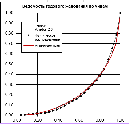 Fig. 3. Diagram of annual salary proportionality by ranks |
4. Averaged work schedule of an American middle manager (Mintzberg, 1973)
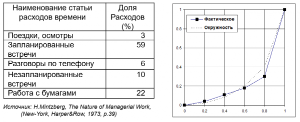
Fig.4
The normalized graphs presented suggest that there is a common pattern in the economic activities they illustrate. Despite radical differences in the specifics of economic activity, in its place and time, it is quite probable that the similarity of the graphs is dictated by some fundamental condition of economic systems functioning. Over millennia of economic activity, based on a vast number of trials and errors, the actors in this activity seem to have found an optimal resource allocation strategy and intuitively use it in their current operations. This assumption aligns well with the well-known Pareto principle: 20% of our efforts produce 80% of the results. Clearly, something similar is observed here. The presented graphs express an empirical regularity that, when transformed into a Lorenz curve, is adequately described with a degree parameter 'alpha' equal to 2. At this parameter, the Lorenz curve becomes part of a circle.
This characteristic, still lacking a stable name, can be called survivability. By analogy with survivability in the wild, the survivability of an economic system is determined by its developed adaptation to the socio-economic environment and its ability to adapt to changes in market conditions.
This means that a system where the expense distribution is close to ideal (with a degree parameter 'alpha' equal to 2, or expense distribution 'by circle') has the greatest chance of remaining in its current form. Notably, in several cases, such distribution also defines the highest profitability of the enterprise. For instance, here. The smaller the deviation coefficient from the ideal, the higher the profitability of the enterprise (Bueva, 2002).
Table (fragment)
| Name of the enterprise, district | Profitability (%) | Deviation coefficient | |
| 1 | State Unitary Enterprise 'Volzhskaya' of Volzhsky District | 13,0 | 0,336 |
| 2 | Agricultural Production Cooperative 'Gornomariyskaya' | 11,1 | 0,18 |
| 3 | Production Cooperative Farm 'Zvenigovsky' | 33,7 | 0,068 |
| 4 | OAO "Mariyskoe" of Medvedevsky District | 7,5 | 0,195 |
| 5 | OAO "Teplichnoe" of Medvedevsky District | 16,3 | 0,107 |
| … | |||
| 47 | SPK (k-z) "Rassvet" of Soviet District | 3,2 | 0,303 |
| 48 | S-z "Bronievik" of Kilemarsky District | 14,2 | 0,117 |
| 49 | SPK SHA "Avangard" of Morkinskiy District | 6,5 | 0,261 |
| 50 | SHA named after Petrov of Morkinskiy District | 22,5 | 0,135 |
Practical Conclusions
When planning expenses, both for companies and households, it is useful to plot the Lorenz curve and compare it with the ideal one. The closer your diagram is to ideal, the more likely it is that you are planning correctly and that your activities will be successful. This proximity confirms that your plans align with the historical economic activities of humanity, reflected in widely recognized empirical regularities such as the Pareto principle.
However, it can be assumed that this pertains to the functioning of a mature economic system focused on profitability. If it is not about maximizing profit, for instance, in the case of modernizing a company or fundamentally increasing its market share, your expense distribution curve will deviate from the circle.
It is clear that even for a startup, with its specific economy, the Lorenz diagram that corresponds to the highest probability of success will also deviate from the circle. One can hypothesize that deviations of the expense distribution curve inward from the circle correspond to both increased risks and reduced adaptability of the company. However, without relying on large statistical datasets on startups (both successful and unsuccessful), substantiated qualified forecasts are unlikely to be possible.
According to another hypothesis, the outward deviation of the expense distribution curve from the circle may signal either excessive regulation of management or an impending bankruptcy. To verify this hypothesis, a certain benchmark database is also necessary, which, as with startups, is unlikely to be publicly available.
In conclusion
The first major publications on this topic date back to 1995 (Matokhin, 1995). The obscurity of these works, given their universality and radically new application of models and tools widely used by economists, remains somewhat of a mystery…
Source: habr.com
