

As is known, some time ago at the annual Surface event, Microsoft announced the new Windows 10X. This system is optimized for use on dual-screen and folding smartphones.
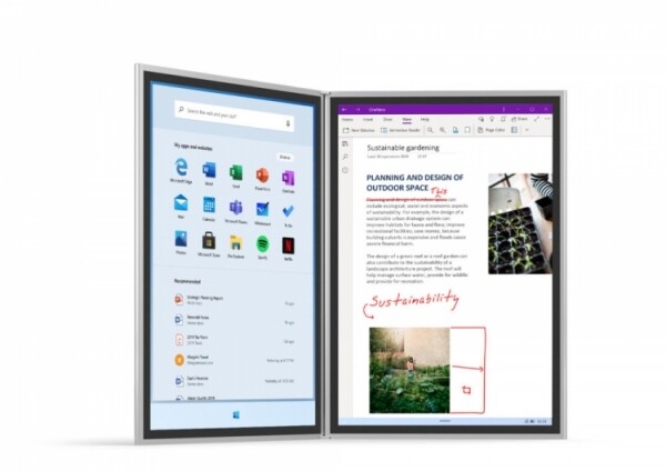
It is worth noting that previously users already submitted a petition to make the Start menu in Windows 10 the same as in Windows 10X. Now the first leaks regarding the design of icons in the new OS have surfaced.

This is quite a logical step considering that Microsoft is currently transitioning to the new Fluent Design platform. The first images have already been published online, which may be concepts for the future icon design. At this time, it is unclear whether they are early, intermediate, or final. However, it can be expected that Microsoft will implement them in the future. So far, only three icons are available: for maps, the alarm system, and the People app.

It should be noted that there is still a considerable amount of time before the release. The launch of the final version of Windows 10X is planned for 2020, and it will debut on the Surface Neo device. After that, we can talk about graphic innovations.
It should also be about the Pegasus project, under which an adaptive graphic shell, Santorini, is being implemented for Windows 10X. Apparently, it will adapt to different devices and provide functionality in both single- and dual-screen modes. However, it will only be visible on new devices.
Source: 3dnews.ru
