

Many people are put off by the word "stenography," and rightfully so, as it implies a complex system that not only takes a long time to learn but also requires constant use to be beneficial. However, I propose that you familiarize yourself with the simplest method of recording Russian spoken language using simplified symbols, which, while it won't increase recording speed by 2-4 times as stenography does, will certainly make the process easier.
It takes about 30 minutes to learn the alphabet (yes, this is accurate and has been verified with a second-grade student from a regular school), and it's advisable to spend another hour reading something in that alphabet, as you will need to practice writing to gain speed throughout the day.
Unlike stenography, which focuses on writing speed and uses symbols of varying sizes that can occupy two squares in height, this method allows us to write brief symbols in each square of the notebook, which not only saves space by half in notes but also conserves ink and our effort in creating complex signs or connections between them.
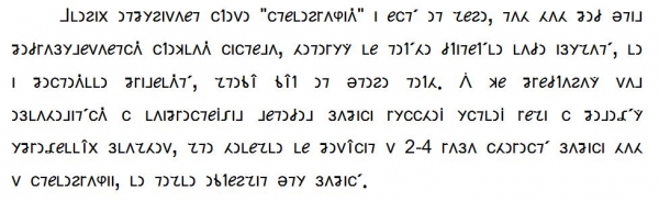
I believe many have already guessed and figured out what is written in the image above. The cryptographic security of this writing is nearly zero, although it allows you to write something on the metro that those sitting nearby will not be able to read (you can also type it if you temporarily set a specific font in the document). Yet, learning this method is easy and quick, and reading such text is not difficult.
You can modify the symbols to your liking if something doesn't seem right to you. I chose them based on their similarity to already known Russian or English letters, and I tried to make the letters that occur more frequently in Russian words (оеаитнсрвлкм…) simpler and therefore quicker to draw. Pay attention to the writing of numbers, as they should be drawn distinctly to avoid confusion with letters.
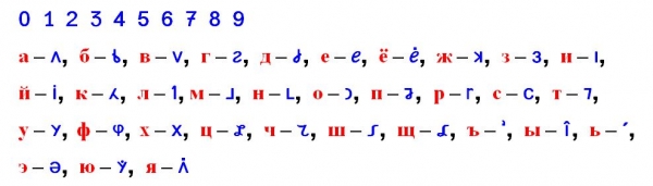
The font here is not perfectly crafted, but more of an example to help you understand the method, and you can read something using this font. You can download it here:
Remembering the alphabet in this way is not difficult, as there are similarities in partial drawing (a),ж - half of the symbol, just like о, т. This may be familiar to you from English (b, d, i), and transcription (ш). The symbol н is chosen with an L-shaped hook, as н is a very frequently used symbol, while the hook for м looks backward, as we usually start writing handwritten м from it. The letter п appears as if it has fallen forward, and this is also easy to remember.
You can try to write capital symbols slightly larger or underline them, as is customary in shorthand. The symbols may differ slightly in writing if that is easier for you. For instance, м and н can be written with a curve, while р should be straight, similar to printed Russian г (although I allow keeping р unchanged if that is more convenient and quicker for you. The same applies to the letter э). To distinguish г and ч, the rarely used ч should be written with a curve at the top (though we have always written similarly and deciphered such handwriting). Write the letter л as a very long one to distinguish it from i, the digit, and the letter т (that’s why т has a straight top, not slanted). You can write the letters б and д like the English b and d with a clear circle at the bottom.
Try to draw clear, straight lines straight, while the semicircle like о should be distinct from the straight line like и. To check for distortion in handwriting due to speed, you can conduct a test: write one letter from the alphabet on each line as quickly as possible, increasing speed toward the end of the line. Then compare the similarity of the letters to each other. If there is similarity, think about what needs to be done to draw such symbols distinctly and quickly.
To the critics from the shorthand community, I immediately clarify that the method was developed based on the tasks at hand, and speed is far from the most important factor. The goal was to create a system of abbreviated character representation that allows for writing in a single square (which shorthand typically does not permit), as simpler and smaller handwriting requires less effort from students. It was also crucial to write letters that are roughly uniform in height for easier readability, since the notes are already quite small. Another significant issue is the impact of handwriting style on comprehension; thus, the differences between letters in terms of slant and distortions must be sufficiently distinct to ensure understanding. The balance of requirements was, as much as possible, maintained, resulting in a slight increase in writing speed, while reading speed for such texts didn't notably decrease.
For those interested in a brief overview of alphabets around the world and the symbols used for writing. , there is also the ancient Russian shorthand.
Source: habr.com
