

Introduction
Why might knowledge of the semantic differential method be needed?
- We can understand our position relative to competitors in consumers' subconscious. It may seem to us that customers have a negative view of our product, but what if we find out that their perception of competitors is even worse based on the criteria most significant to us?
- We can assess how successful our advertising is compared to the advertisements of competing products in the same category (Call of Duty or Battlefield?)
- We will determine what needs improvement in our positioning. Is the image of the company or product perceived as 'cheap'? Clearly, during the next advertising campaign, we will either have to accept this status and remain in this corner of consumer consciousness, or urgently change our development direction. Xiaomi positions itself as a cheaper alternative to flagship devices with similar hardware. They have a clearly defined position that sets them apart from well-known competitors who present themselves as premium – Apple, Samsung, etc. One of the main issues in this case will be the association (and this is precisely what the entire method is based on) with the word 'cheap' which may also lead to the association of 'bad' or 'low-quality.'
By the way, this applies when comparing any other objects in the chosen category — you can compare processors, phones, and news portals! Essentially, the imagination for applying this method is limitless.
How should I determine the specific criteria for comparing our products?
In principle, there are different ways to answer this question – you can conduct expert interviews, semi-structured interviews, or choose the focus group method. Some of the categories you obtain may also be found on the internet – this should not concern you. Remember, the most important aspect of your research is not the uniqueness of the data obtained, but their objectivity and reliability.
It should also be noted that I have come across similar phrases in various textbooks: "Bad is usually associated with cold, dark, low; good – with warm, light, high." Imagine if Sprite, after yet another ad saying "Quench your thirst," finds that their drink is still associated with warmth?
That’s why it is important to pay attention to what exactly we are working with – if we get the word "calm" in the associative array for an app whose main goal is relaxation, it does not necessarily mean we want the same characteristic for a shooter. To some extent, evaluation is the most subjective part of this method, but we must remember that it is initially oriented towards working with an associative array, which can vary from consumer to consumer (this is why studying your target audience becomes another important factor, often conducted through surveys or structured interviews).
Methodology
Even before the beginning of the stage, we must determine which advertising messages (we will analyze everything based on this example) we want to test. In our case, these will be ads for the following phones:


For the sake of simplicity, let’s take two respondents.
The first stage is the determination of categories for study.
Let’s assume that with the help of focus groups we managed to identify the following 9 categories (the number is not arbitrary – originally it was suggested that exactly this many criteria, divided into 3 equal groups – evaluation factors (E), strength factor (R), and activity factor (A) should be determined by the author):
- Exciting 1 2 3 4 5 6 7 Calming
- Ban banal 1 2 3 4 5 6 7 Unique
- Natural 1 2 3 4 5 6 7 Artificial
- Cheap 1 2 3 4 5 6 7 Expensive
- Creative 1 2 3 4 5 6 7 Ban banal
- Repulsive 1 2 3 4 5 6 7 Attractive
- Bright 1 2 3 4 5 6 7 Dim
- Dirty 1 2 3 4 5 6 7 Clean
- Dominant 1 2 3 4 5 6 7 Secondary
The second stage is developing the questionnaire.
A methodologically correct questionnaire for two respondents regarding two ads would have the following format:
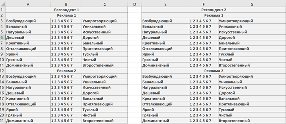
As you may notice, the minimum and maximum values vary depending on the row. According to the creator of this method, Charles Osgood, this approach helps to check the respondent's attention and the degree of their engagement in the process (noticing and clarifying is great!). However, some researchers (especially unscrupulous ones) may not alternate the scales to avoid inverting them later. Thus, they skip the fourth item on our list.
The third stage is data collection, entering it into our scale.
From this point onward, you can either start entering data into Excel (as I did for greater convenience) or continue doing everything manually, depending on how many people you decided to survey (In my view, Excel is more convenient, but with a small number of respondents, calculating manually might be faster).
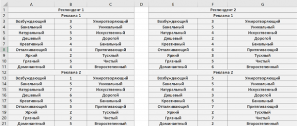
The fourth stage is recovering the scales.
If you decided to follow the "correct" method, then you will now find that you need to bring the scales to a common value. In this case, I decided that my maximum value will be "7" and the minimum will be "1". Consequently, the even columns remain untouched. We will "recover" the remaining values (reflect the values — 1 7, 2 6, 3 5, 4 = 4).
Now our data will be represented as follows:
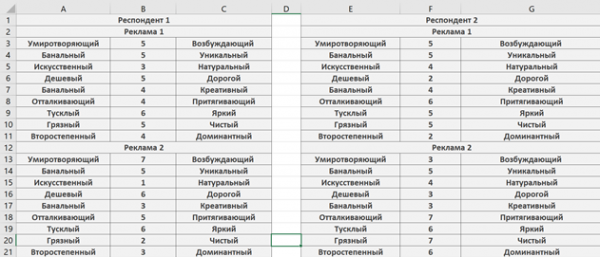
The fifth stage is calculating averages and overall indicators.
The most popular indicators are the "winner" for each scale ("best") and the "loser" for each scale ("worst").
We obtain these by standard summation and dividing by the number of respondents for each brand based on the selected characteristic and subsequently comparing them.
Average indicators for each advertisement in the recovered form:
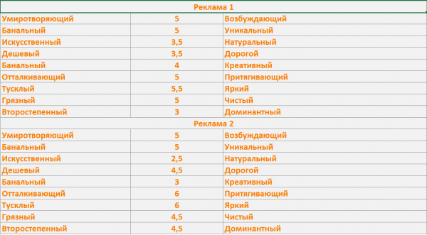
- Exciting and calming – equal indicators (5).
- Banal and unique – equal indicators (5).
- Most natural – advertisement 1.
- Most expensive – advertisement 2.
- Most creative – advertisement 1.
- Most attractive – advertisement 2.
- Brightest – advertisement 2.
- Cleanest – advertisement 1.
- Most dominant – advertisement 2.
Now let's move on to the overall metrics. In this case, we will need to sum up each brand based on all its ratings received from all respondents across all characteristics (our averages will come in handy here). This way, we will identify the 'absolute leader' (there could be 2 or even 3).
Total score – Ad 1 (39.5 points). Ad 2 (41 points).
Winner – Ad 2.
The main thing is to be clearly aware that the winner without a significant lead is easy prey.
The sixth stage – building perception maps.
One of the most acceptable and pleasant sights for the eyes since its introduction into science by Ancherson and Kroen has been graphs and tables. In reports, they appear much clearer, which is why Charles borrowed perception maps from more precise sciences and psychology. They help visually reflect where exactly your brand/ad/product stands. They are constructed by assigning two values to both axes – for example, the X-axis will represent the criterion 'dirty-clean,' and the Y-axis 'dull-bright.'
Building a map:
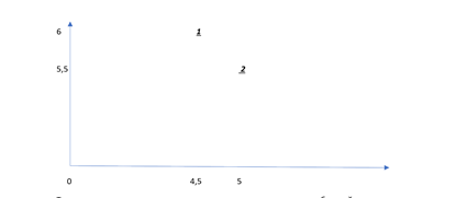
Now we can visually see how two representative products from well-known companies are perceived by consumers.
The main advantage of perception maps is their convenience. They make it relatively easy to analyze consumer preferences and the images of different brands. This, in turn, is crucial for creating effective advertising messages, using a scale that evaluates a product based on certain criteria.
Summary
As you can see, the method in its shortened form is not difficult to understand; it can be applied not only by professionals in social and marketing research methodology but also by ordinary users.
Source: habr.com
