

In the last couple of years, I've been spending more time on documentation. Writing explanatory text about how a certain system works is generally quite simple. Drawing a diagram that displays all key objects and the relationships between them is also fairly easy.
But the most problematic aspect is keeping this documentation up to date. It's one thing for the text, but the diagrams... Since all documentation is online, in HTML format, the text comes with images in gif/jpeg/png formats that depict the diagrams. These diagrams are drawn in various programs like Visio or online services such as draw.io. Then you export the diagram in a graphic format and attach it to the HTML. It's straightforward.
What’s the problem?
The diagrams are usually simple. In fact, not particularly complex. Yes, the number of objects is ten or two dozen, and the number of connections is about the same. Plus annotations and some symbols. Simple diagrams can be described in words, while overly complex ones, um... (c) 'will not be understood'. There are many diagrams, and changes need to be made periodically—constantly, in fact, as they follow the development of our products.
Isn’t it possible to embed an HTML service? Have you tried?
Yes, of course. For example, I like the graphics from gliffy.com. But for modifications, you have to go to an external service and edit there. It’s also more difficult to delegate the task of making adjustments to a colleague.
What to do?
Recently, on GitHub, I came across a recommended repository . Diagram as code. That is, we describe the desired diagram in JS. This JS is written right in the same HTML as the rest of the documentation text.
By the way, I don't write documentation entirely in HTML. Usually, documentation consists of a set of files with markdown text that is then converted into a complete documentation site using some engine, like wintersmith, or a wiki system.
It’s very convenient: we write the text, then we open the script tag where the JS code for the diagram is described.
What’s wrong now?
I liked this repository, but it’s not the only example where diagrams are drawn using code or textual representations. (At the end of the article, there will be links to projects and articles that I found on the topic of diagram as code.)
And I'm not the only one working on the documentation. Sometimes my colleagues contribute as well — correcting words, changing descriptions, inserting new images.
Therefore, I'd like to see the diagram in a readable and understandable text format, which wouldn't require extensive training. In some cases, it would also be nice to just copy-paste for quicker addition of new schemes.
Another colleague pointed out that while code is good, using a structured format can be very strict and expressive.
So, I tried to represent the scheme as a set of several small arrays that describe nodes, connections, groups of nodes, and the positioning of nodes. In my humble opinion, it turned out to be quite convenient, although, of course, preferences may vary...
How is this a diagram in an array?
- Each node is described by an identifier that uniquely defines the node.
- You can also add an icon to the node and include a label.
- You can specify a connection between two nodes.
- For the connection in the diagram, you can set a color and a label.
- The direction of the connection is defined from source to target. The source and target are indicated by the node identifiers.
- One or more nodes can be added to a group.
- Connections can also be specified from a group and to a group.
Following these simple rules, we can get such a scheme. Easy? Quite.
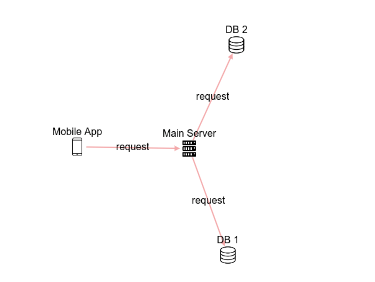
And it is described by the following JS code. The main part here is the elements object, which includes nodes and edges.
  const elements = {
    nodes: [       // describing nodes
      { id: 'client', type: 'smartphone', label: 'Mobile App'},
      { id: 'server', type: 'server', label: 'Main Server'},
      { id: 'db1', type: 'database', label: 'DB 1'},
      { id: 'db2', type: 'database', label: 'DB 2'},
    ],
    edges: [       // specifying connections
      { source: 'client', target: 'server', label: 'request' },
      { source: 'server', target: 'db1', label: 'request' },
      { source: 'server', target: 'db2', label: 'request' },
    ],
  };
  Diagram('scheme1', elements);
Of course, I didn't come up with the diagram rendering myself; I used a library for it. — a very powerful visualization tool. I only use a fraction of its capabilities in my solution.
It's clear this is a simple example. Can we make it more complex?
Yes, please. For specifying positions — we use positions, for defining groups — we provide a list of groups in groups, and the elements themselves have the group attribute.
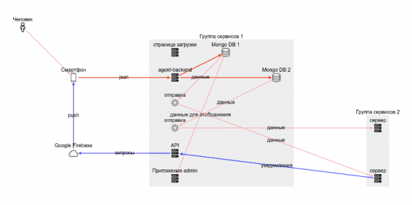
And here is the code:
<div id="scheme5" style="height:500px;width:800px;"></div>
<script>
  const elements5 = {
    groups: [
      { id: 'g1', label: 'Группа сервисов 1'},
      { id: 'g2', label: 'Группа сервисов 2'},
    ],
    nodes: [
      { id: 'man1', type: 'person', label: 'Человек'},
      { id: 'client', type: 'smartphone', label: 'Смартфон'},
      { id: 'agent-backend', type: 'server', group: 'g1', label: 'agent-backend'},
      { id: 'web', type: 'server', group: 'g1', label: 'Приложение admin'},
      { id: 'www', type: 'server', group: 'g1', label: 'страница загрузки'},
      { id: 'mongodb1', type: 'database', group: 'g1', label: 'Mongo DB 1'},
      { id: 'mongodb2', type: 'database', group: 'g1', label: 'Mongo DB 2'},
      { id: 'runner-integration1', type: 'worker', group: 'g1', label: 'отправка'},
      { id: 'runner-integration2', type: 'worker', group: 'g1', label: 'отправка'},
      { id: 'api', type: 'server', group: 'g1', label: 'API'},
      { id: 'server2', type: 'server', group:'g2', label: 'сервер'},
      { id: 'otherServer', type: 'server', group:'g2', label: 'сервер'},
      { id: 'firebase', type: 'cloud', label: 'Google Firebase'},
    ],
    edges: [
      { source: 'client', target: 'agent-backend', label: 'json', color: 'red' },
      { source: 'agent-backend', target: 'mongodb1', color: 'red' },
      { source: 'agent-backend', target: 'mongodb2',  color: 'red' },
      { source: 'mongodb1', target: 'runner-integration1', label: 'данные' },
      { source: 'mongodb2', target: 'runner-integration2', label: 'данные' },
      { source: 'mongodb1', target: 'web', label: 'данные для отображения' },
      { source: 'runner-integration1', target: 'server2', label: 'данные' },
      { source: 'runner-integration2', target: 'otherServer', label: 'данные' },
      { source: 'api', target: 'firebase', label: 'запросы', color: 'blue', },
      { source: 'firebase', target: 'client', label: 'push', color: 'blue'},
      { source: 'server2', target: 'api', label: 'уведомления', color: 'blue'},
      { source: 'man1', target: 'client', },
    ],
    positions: [
      { id: 'client', row: 2, col: 1,},
      { id: 'agent-backend', row: 2, col: 3,},
      { id: 'web', row: 6, col: 3,},
      { id: 'www', row: 1, col: 3,},
      { id: 'mongodb1', row: 1, col: 4,},
      { id: 'mongodb2', row: 2, col: 5,},
      { id: 'runner-integration1', row: 3, col: 3,},
      { id: 'runner-integration2', row: 4, col: 3,},
      { id: 'api', row: 5, col: 3,},
      { id: 'server2', row: 6, col: 7,},
      { id: 'otherServer', row: 4, col: 7,},
      { id: 'firebase', row: 5, col: 1,},
      { id: 'logger', row: 2, col: 7,},
      { id: 'crm', row: 5, col: 8,},
    ],
};
  Diagram('scheme5', elements5, {layout: 'grid'});
</script>
On one hand, this scheme resembles almost two screens of code on a laptop, while on the other, a JSON-like structure allows for quickly filling in all the data in a similar way that enables copy-pasting.
Why are positions separated from the nodes?
It’s more convenient this way. First, we specify nodes. Then we can designate a couple of groups and include them in the nodes. After that, we define the relationships. Finally, once the main objects and their interconnections are established, we address the arrangement of these objects on the scheme. Or vice versa.
Can we do it without positions?
Yes, it’s possible without positions. However, it might be a bit cramped; you can check such a variant in the examples. This is due to the fact that Cytoscape has an algorithm for arranging nodes. , which also considers the presence of groups. Specifying positions makes the schema more manageable, but at the initial sketch stage, it can be done without them.
Positions can also be specified in a Battleship-style. That is, one node is placed at a1, and another at d5. It is especially helpful because Cytoscape creates movable objects on the canvas, meaning we can move them around, explore different layout options, and then fix the arrangement of elements in code that we like.
Overall, it’s clear. Can we give it a try?
Of course, I made a small tool for quickly creating schemas. , which automatically updates the schema and stores the latest version in the browser (in localStorage).
Have you tried it? You can now add it to your own page.
Then once more:
1. Connect the script
<script src="https://unpkg.com/@antirek/network-diagram@0.1.4/dist/code-full.min.js"></script>
2. Add to the HTML code
<div id="scheme1" style="height:300px;width:800px;"></div>
<script>
  const elements = {
    nodes: [
      { id: 'client', type: 'smartphone', label: 'Mobile App'},
      { id: 'server', type: 'server', label: 'Main Server'},
      { id: 'db1', type: 'database', label: 'DB 1'},
      { id: 'db2', type: 'database', label: 'DB 2'},
    ],
    edges: [
      { source: 'client', target: 'server', label: 'request' },
      { source: 'server', target: 'db1', label: 'request' },
      { source: 'server', target: 'db2', label: 'request' },
    ],
  };
  Diagram('scheme1', elements);
</script>
3. edit the code to fit our needed schema (I think this is simpler than drawing an owl 🙂
More details on on GitHub.
What’s the result?
I achieved my goals — to enable inline schema insertion into documentation; the format is quite simple and easy to understand. It may not be suitable for super schemas, but for small diagrams that clarify relationships, it works quite well. You can always quickly adjust and change something over time. Plus, colleagues can edit the documentation themselves without much training, at least the labels for objects.))
What can be improved?
There are certainly many options here. Adding more icons (all available icons are included inline in the script). Selecting a more expressive set of icons. Allowing the specification of line styles for connections. Adding a background image.
What do you think?
I already have a few ideas for implementation in the issues, feel free to add yours in the comments.
My solution is definitely applicable in a narrow range of tasks, and you might find a more convenient tool for drawing diagrams by simply coding them — as they say, 'show me your diagram as code.'
- (9 types of charts online editor)
- And if you love super detailed and complex diagrams, this project will definitely impress you:
Source: habr.com
