

In this article, I want to share my experience of using open source Zabbix and Grafana systems to visualize the work of production lines. The information may be useful to those who are looking for a quick way to visually display or analyze the collected data in industrial automation or IoT projects. The article is not a detailed guide, but rather a concept of a monitoring system based on open source software for a manufacturing enterprise.
Toolkit
Zabbix - we have been using it for a long time to monitor the IT infrastructure of the plant. The system turned out to be so convenient and versatile that we began to enter data from production lines, sensors and controllers into it. This allowed us to collect all the metrics data in one place, make simple graphs of resource consumption and equipment performance, but we really lacked analytics and beautiful graphs.
grafana is a powerful tool for analytics and data visualization. A large number of plugins allow you to take data from various sources (zabbix, clickhouse, influxDB), process it on the fly (calculate the average, sum, difference, etc.) and draw all kinds of graphs (from simple lines, speedometers, tables to complex diagrams ).
Draw.io - a service that allows you to draw in an online editor from a simple block diagram to a floor plan. There are many ready-made templates and drawn objects. Data can be exported to all major graphic formats or xml.
Putting it all together
A lot of articles have been written on how to install and configure Grafana and Zabbix, I will talk about the main points of the configuration.
On Zabbix server A "network node" (host) is created, which will contain the "data elements" (items) with metrics from our sensors. It's a good idea to think through the names of nodes and data elements in advance and make them as structured as possible, as we'll be accessing them from Grafana using regular expressions. This approach is convenient because it allows you to retrieve data from a group of elements with a single request.
To configure grafana, you will need to install additional plugins:
- Zabbix by Alexander Zobnin (alexanderzobnin-zabbix-app) - integration with zabbix
- natel-discrete-panel - plugin for discrete visualization on a horizontal chart
- pierosavi-imageit-panel - plugin for displaying data on top of your image
- agenty-flowcharting-panel - plugin for dynamic diagram visualization from draw.io
The integration with Zabbix itself is configured in grafana, menu item ConfigurationData sourcesZabbix. There you need to specify the api address of the zabbix server, I have this , and a login with a password for access. If everything is done correctly, when saving the settings, there will be a message with the api version number: zabbix API version: 5.0.1
Creating a Dashboard
This is where the very magic of grafana and its plugins begins.
natel-discrete-panel plugin
We have data on the statuses of engines on the lines (working = 1, not working =0). Using the discrete graph, we can draw a scale that will show: the status of the engine, how many minutes / hours or % it has worked, and how often it has been started.
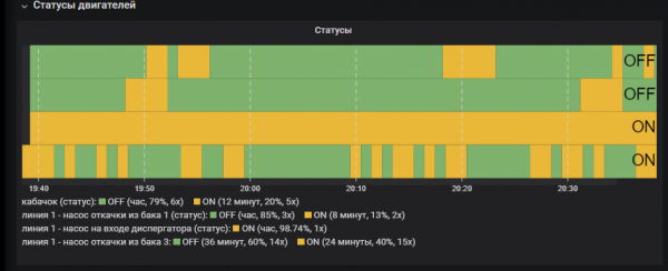
Engine status visualization
In my opinion, this is one of the best graphs for visualizing hardware performance. You can immediately see how long it is idle, in what modes it works more often. There can be a lot of data, it is possible to aggregate them by ranges, convert by values (if the value is "1", then display as "ON")
pierosavi-imageit-panel plugin
Imageit is convenient to use when you already have a drawn diagram or plan of the room on which you want to apply data from sensors. In the visualization settings, you need to specify the url address for the image and add the sensor elements you need. The element appears on the picture and can be placed in the right place with the mouse.
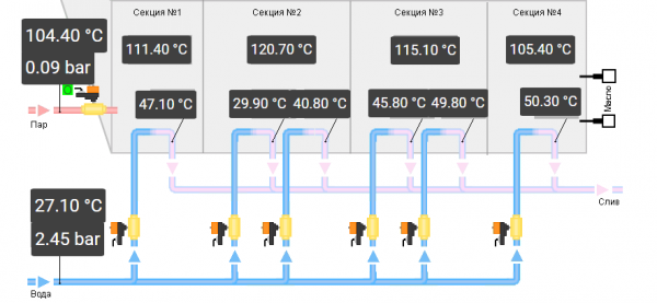
Scheme of the furnace with temperature and pressure metrics
agenty-flowcharting-panel plugin
I would like to tell you more about creating a FlowCharting visualization, as it is an incredibly functional tool. It allows you to make a dynamic mnemonic, the elements of which will respond to the values of the metrics (change color, position, name, etc.).
Getting data
The creation of any visualization element in grafana begins with a request for data from the source, in our case it is zabbix. Using queries, we need to get all the metrics that we want to use in the diagram. Metric details are the names of data elements in Zabbix, you can specify both a separate metric and a set with filtering through a regular expression. In my example, the Item field contains the expression: "/(^line 1)|(availability)|(zucchini)/" - this means: select all metrics whose name strictly begins with "line 1" or contains the word "availability" or contains the word "zucchini"
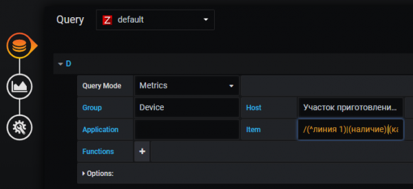
An example of setting up a request for data on the engines of the first line and the availability of raw materials
Data conversion
The source data may not always be in the form in which we need to display it. For example, we have minute-by-minute data on the weight of a product in a container (kg), and we want to display the fill rate in t/h. I do it this way: I take the weight data and convert it with the delta graphana function, which calculates the difference between the metric values, so the current weight is converted to kg / min. Then I multiply by 0.06 to bring the result to tons/hour. Since the weight metric is used in multiple queries, I'll give it a new alias (setAlias) and use it in the render rule.
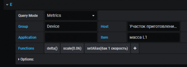
An example of using the delta parameter and a multiplier and renaming a metric in a query
Here is another example of data transformation: I needed to calculate the number of batches (cycle start = engine start). The metric is calculated based on the engine status "line 1 - tank pump 1 (status)". Transformation: we change the data of the original metric with the delta function (value difference), so the metric will have the value "+1" to start the engine, "-1" to stop and "0" when the engine does not change its status. Then I remove all values less than 1 and sum them up. The result is the number of engine starts.
![]()
Example of converting data from current status to number of starts
Now about the visualization itself
In the display settings there is a button "Edit Draw", it launches an editor in which you can draw a diagram. Each object on the diagram has its own parameters. For example, if you specify font settings in the editor, they will be applied to data visualization in grafana.
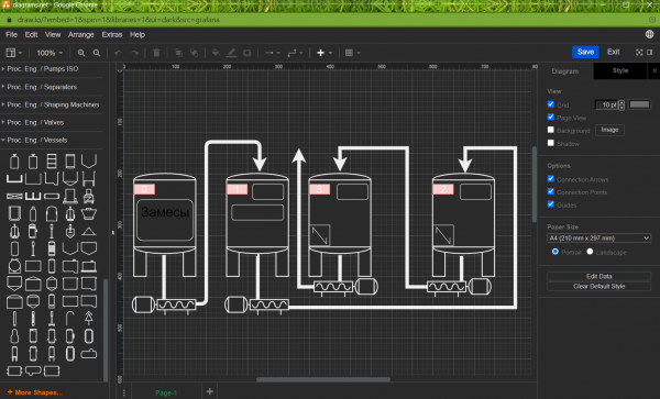
This is what the editor looks like in Draw.io
After saving the scheme, it will appear in the graphana and it will be possible to create rules for changing elements.
In the parameters () we specify:
- Options - set the name of the rule (Rule name), the name or alias of the metric whose data will be used (Apply to metrics). The type of data aggregation (Aggregation) affects the final result of the metric, so Last means that the last value will be selected, avg means the average value for the period selected in the upper right corner.
- Thresholds - threshold values parameter, describes the logic of color application, that is, the selected color will be applied to the elements on the diagram, depending on the metric data. In my example, if the metrics value is “0”, the status will be “Ok”, the color will be green, if the value is “>1”, the status will be Critical and the color will be red.
- Color/Tooltip Mappings” and “Label/Text Mappings” — selection of a circuit element and its behavior scenario. In the first scenario, the object will be painted over, in the second - it will have text with data from the metric. To select an object on the diagram, you need to press the circuit sign and click on the diagram with the mouse.
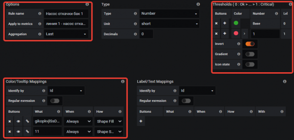
In this example, I paint the pump and its arrow red if it is working and green if it is not.
With the help of the flowcharting plugin, I managed to draw a diagram of the entire line, on which:
- the color of the aggregates changes according to their status
- there is an alarm for the lack of product in containers
- motor frequency setting is displayed
- fill/discharge rate of the first tank
- the number of line operation cycles (batch) is counted
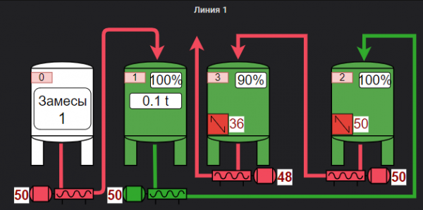
Visualization of the production line
Experience the Power of Effective Results
The hardest part for me was getting the data from the controllers. Thanks to the versatility of Zabbix in terms of data acquisition and the flexibility of Grafana through plugins, it took only a couple of days to create a comprehensive screen for monitoring the production line. The visualization made it possible to view graphs and status statistics, plus easy access via the web to anyone interested - all this made it possible to quickly identify bottlenecks and inefficient use of aggregates.
Conclusion
I really liked the Zabbix + Grafana bundle and I recommend paying attention to it if you need to quickly process data from controllers or sensors without programming or implementing complex commercial products. Of course, this will not replace professional SCADA systems, but it will be enough as a tool for centralized monitoring of the entire production.
Source: habr.com
