

Hello, Habr!
Today we will work on the skill of using grouping and data visualization tools in Python. In the provided we will analyze several characteristics and create a set of visualizations.
As usual, let's start by defining our goals:
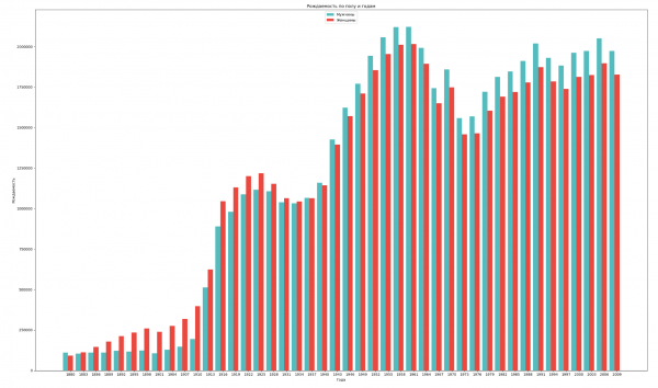
- Group the data by gender and year, and visualize the overall birth trends for both genders;
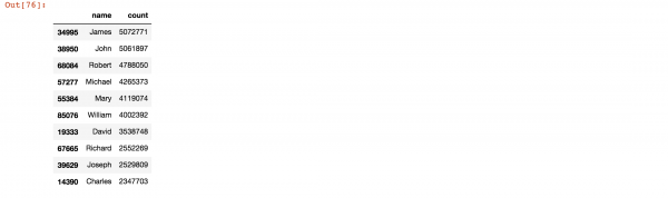
- Find the most popular names throughout history;
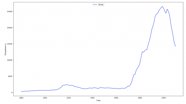
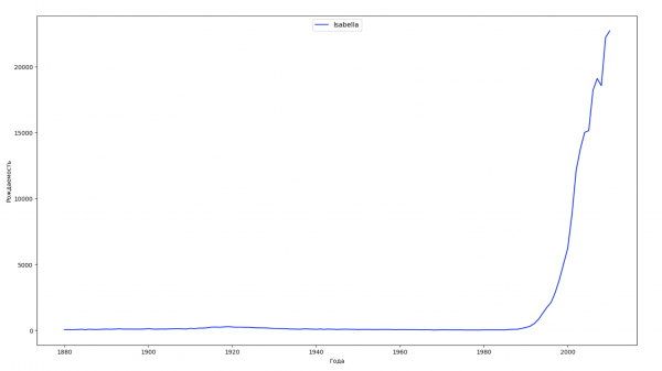
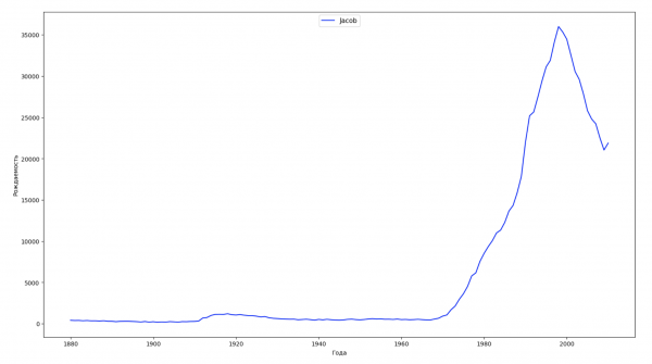
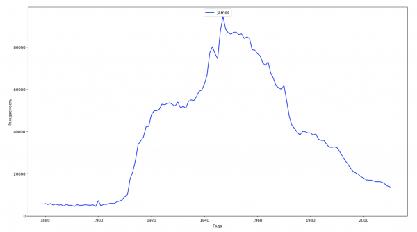
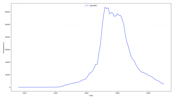
- Divide the entire time span in the data into 10 segments and for each, find the most popular name for each gender. For each name found, visualize its trend over time;
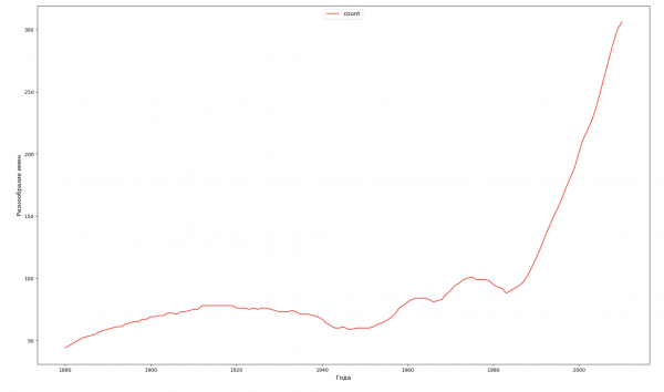
- For each year, calculate how many names cover 50% of the population and visualize this (we will see the diversity of names for each year);
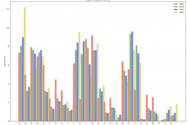
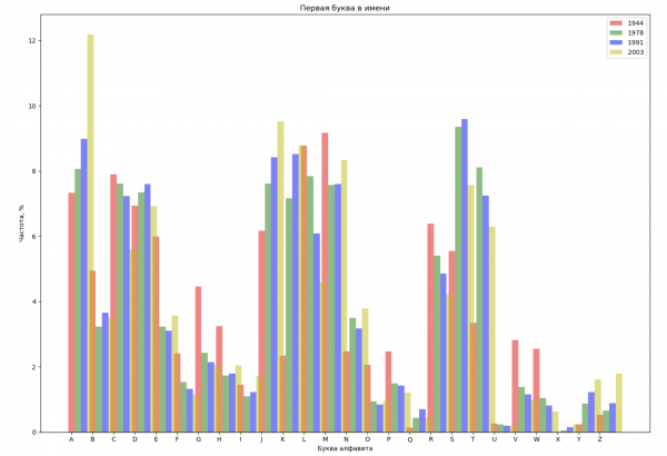
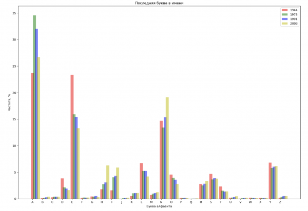
- Select 4 years from the entire span and display for each year the distribution by the first letter of the name and by the last letter of the name;
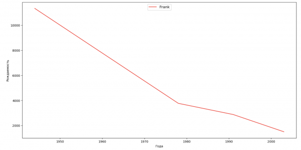
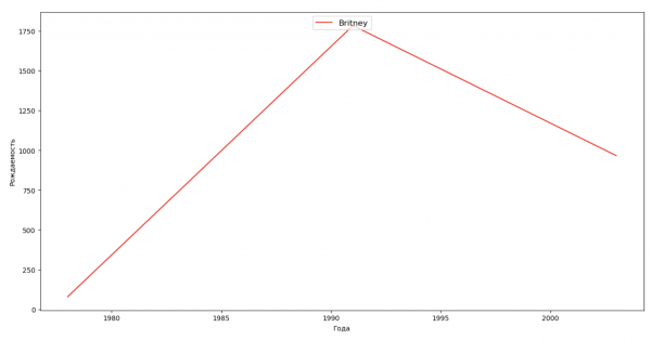
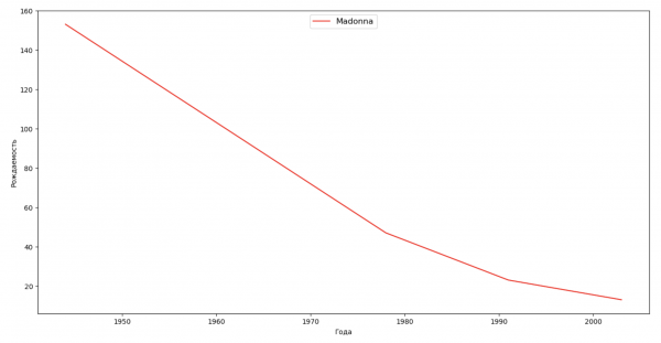
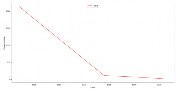
- Compile a list of several famous people (presidents, singers, actors, movie characters) and assess their influence on naming trends. Create a clear visualization.
Less talk, more code!
And let's get started.
Let's group the data by gender and year and visualize the overall birth trends for both genders:
import numpy as np
import pandas as pd
import matplotlib.pyplot as plt

years = np.arange(1880, 2011, 3)
datalist = 'https://raw.githubusercontent.com/wesm/pydata-book/2nd-edition/datasets/babynames/yob{year}.txt'
dataframes = []
for year in years:
    dataset = datalist.format(year=year)
    dataframe = pd.read_csv(dataset, names=['name', 'sex', 'count'])
    dataframes.append(dataframe.assign(year=year))

result = pd.concat(dataframes)
sex = result.groupby('sex')
births_men = sex.get_group('M').groupby('year', as_index=False)
births_women = sex.get_group('F').groupby('year', as_index=False)
births_men_list = births_men.aggregate(np.sum)['count'].tolist()
births_women_list = births_women.aggregate(np.sum)['count'].tolist()

fig, ax = plt.subplots()
fig.set_size_inches(25,15)

index = np.arange(len(years))
stolb1 = ax.bar(index, births_men_list, 0.4, color='c', label='Men')
stolb2 = ax.bar(index + 0.4, births_women_list, 0.4, alpha=0.8, color='r', label='Women')

ax.set_title('Births by Gender and Year')
ax.set_xlabel('Years')
ax.set_ylabel('Births')
ax.set_xticklabels(years)
ax.set_xticks(index + 0.4)
ax.legend(loc=9)

fig.tight_layout()
plt.show()
Let's find the most popular names throughout history:
years = np.arange(1880, 2011)

dataframes = []
for year in years:
    dataset = datalist.format(year=year)
    dataframe = pd.read_csv(dataset, names=['name', 'sex', 'count'])
    dataframes.append(dataframe)

result = pd.concat(dataframes)
names = result.groupby('name', as_index=False).sum().sort_values('count', ascending=False)
names.head(10)
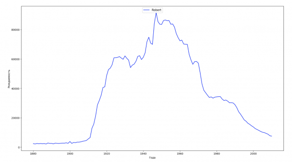
We will divide the entire time span of the data into 10 parts and find the most popular name for each gender within each part. For each name found, we will visualize its trend over time:
years = np.arange(1880, 2011)
part_size = int((years[years.size - 1] - years[0]) / 10) + 1
parts = {}
def GetPart(year):
    return int((year - years[0]) / part_size)
for year in years:
    index = GetPart(year)
    r = years[0] + part_size * index, min(years[years.size - 1], years[0] + part_size * (index + 1))
    parts[index] = str(r[0]) + '-' + str(r[1])

dataframe_parts = []
dataframes = []
for year in years:
    dataset = datalist.format(year=year)
    dataframe = pd.read_csv(dataset, names=['name', 'sex', 'count'])
    dataframe_parts.append(dataframe.assign(years=parts[GetPart(year)]))
    dataframes.append(dataframe.assign(year=year))

result_parts = pd.concat(dataframe_parts)
result = pd.concat(dataframes)

result_parts_sums = result_parts.groupby(['years', 'sex', 'name'], as_index=False).sum()
result_parts_names = result_parts_sums.iloc[result_parts_sums.groupby(['years', 'sex'], as_index=False).apply(lambda x: x['count'].idxmax())]
result_sums = result.groupby(['year', 'sex', 'name'], as_index=False).sum()

for groupName, groupLabels in result_parts_names.groupby(['name', 'sex']).groups.items():
    group = result_sums.groupby(['name', 'sex']).get_group(groupName)
    fig, ax = plt.subplots(1, 1, figsize=(18,10))

    ax.set_xlabel('Years')
    ax.set_ylabel('Birth Rate')
    label = group['name']
    ax.plot(group['year'], group['count'], label=label.aggregate(np.max), color='b', ls='-')
    ax.legend(loc=9, fontsize=11)

    plt.show()
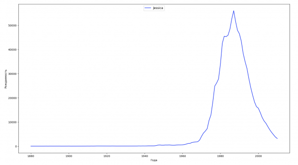
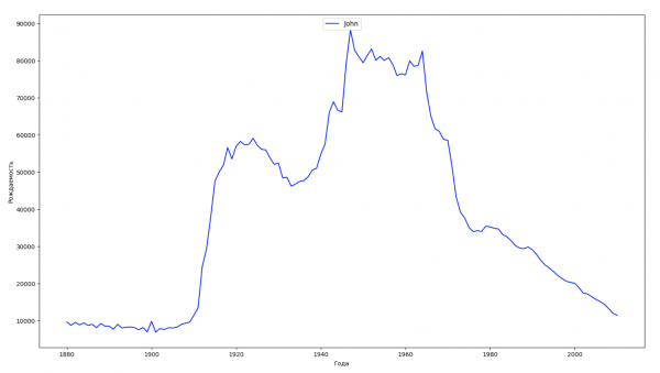
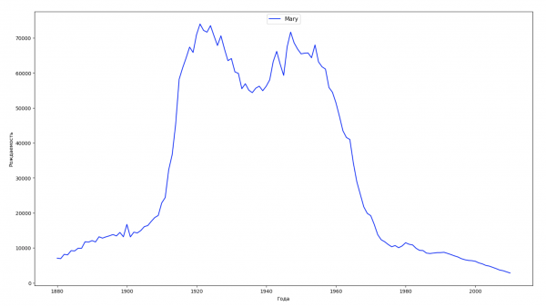
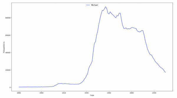
For each year, we will calculate how many names cover 50% of the population and visualize this data:
dataframe = pd.DataFrame({'year': [], 'count': []})
years = np.arange(1880, 2011)
for year in years:
    dataset = datalist.format(year=year)
    csv = pd.read_csv(dataset, names=['name', 'sex', 'count'])
    names = csv.groupby('name', as_index=False).aggregate(np.sum)
    names['sum'] = names.sum()['count']
    names['percent'] = names['count'] / names['sum'] * 100
    names = names.sort_values(['percent'], ascending=False)
    names['cum_perc'] = names['percent'].cumsum()
    names_filtered = names[names['cum_perc'] <= 50]
    dataframe = dataframe.append(pd.DataFrame({'year': [year], 'count': [names_filtered.shape[0]]}))

fig, ax1 = plt.subplots(1, 1, figsize=(22,13))
ax1.set_xlabel('Years', fontsize = 12)
ax1.set_ylabel('Name Diversity', fontsize = 12)
ax1.plot(dataframe['year'], dataframe['count'], color='r', ls='-')
ax1.legend(loc=9, fontsize=12)

plt.show()
We will select 4 years from the entire span and display for each year the distribution of names based on the first letter and the last letter in the name:
from string import ascii_lowercase, ascii_uppercase

fig_first, ax_first = plt.subplots(1, 1, figsize=(14,10))
fig_last, ax_last = plt.subplots(1, 1, figsize=(14,10))

index = np.arange(len(ascii_uppercase))
years = [1944, 1978, 1991, 2003]
colors = ['r', 'g', 'b', 'y']
n = 0
for year in years:
    dataset = datalist.format(year=year)
    csv = pd.read_csv(dataset, names=['name', 'sex', 'count'])
    names = csv.groupby('name', as_index=False).aggregate(np.sum)
    count = names.shape[0]

    dataframe = pd.DataFrame({'letter': [], 'frequency_first': [], 'frequency_last': []})
    for letter in ascii_uppercase:
        countFirst = (names[names.name.str.startswith(letter)].count()['count'])
        countLast = (names[names.name.str.endswith(letter.lower())].count()['count'])

        dataframe = dataframe.append(pd.DataFrame({
            'letter': [letter],
            'frequency_first': [countFirst / count * 100],
            'frequency_last': [countLast / count * 100]}))

    ax_first.bar(index + 0.3 * n, dataframe['frequency_first'], 0.3, alpha=0.5, color=colors[n], label=year)
    ax_last.bar(index + bar_width * n, dataframe['frequency_last'], 0.3, alpha=0.5, color=colors[n], label=year)
    n += 1

ax_first.set_xlabel('Letter of the Alphabet')
ax_first.set_ylabel('Frequency, %')
ax_first.set_title('First Letter in Name')
ax_first.set_xticks(index)
ax_first.set_xticklabels(ascii_uppercase)
ax_first.legend()

ax_last.set_xlabel('Letter of the Alphabet')
ax_last.set_ylabel('Frequency, %')
ax_last.set_title('Last Letter in Name')
ax_last.set_xticks(index)
ax_last.set_xticklabels(ascii_uppercase)
ax_last.legend()

fig_first.tight_layout()
fig_last.tight_layout()

plt.show()
Let's create a list of several well-known individuals (presidents, singers, actors, movie characters) and evaluate their impact on the dynamics of names:
celebrities = {'Frank': 'M', 'Britney': 'F', 'Madonna': 'F', 'Bob': 'M'}
dataframes = []
for year in years:
    dataset = datalist.format(year=year)
    dataframe = pd.read_csv(dataset, names=['name', 'sex', 'count'])
    dataframes.append(dataframe.assign(year=year))

result = pd.concat(dataframes)

for celebrity, sex in celebrities.items():
    names = result[result.name == celebrity]
    dataframe = names[names.sex == sex]
    fig, ax = plt.subplots(1, 1, figsize=(16,8))

    ax.set_xlabel('Year', fontsize = 10)
    ax.set_ylabel('Birth Rate', fontsize = 10)
    ax.plot(dataframe['year'], dataframe['count'], label=celebrity, color='r', ls='-')
    ax.legend(loc=9, fontsize=12)

    plt.show()
For practice, you can add the period of the celebrity's life to the visualization from the last example to illustrate their impact on the dynamics of names more clearly.
With this, all our goals have been achieved and fulfilled. We have worked on the skill of using data grouping and visualization tools in Python, and we will continue to work with data further. Everyone can draw conclusions from the already prepared, visualized data on their own.
Wishing everyone knowledge!
Source: habr.com
