

Note: translation.The author of this material is Cindy Sridharan, an engineer at imgix, specializing in API development and, in particular, microservices testing. In this piece, she shares her detailed insights on current issues in distributed tracing, where, in her opinion, there is a lack of truly effective tools to solve pressing problems.
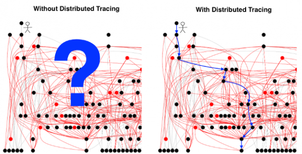
[Illustration borrowed from on distributed tracing.]
It is believed that is difficult to implement, and its payoff is . The challenges of tracing are explained by numerous reasons, often citing the complexity of configuring each system component to transmit the relevant headers with each request. While this problem does exist, it cannot be labeled as insurmountable. Interestingly, it doesn't explain why developers are not particularly fond of tracing (even when it is already operational).
The main difficulty with distributed tracing is not data collection, not standardizing formats for dissemination and presentation of results, and not determining when, where, and how to sample. I do not mean to suggest that these "usability problems" are trivial — in fact, there are quite significant technical and (when considering truly open-source standards and protocols However, if we imagine that all these problems are solved, it is highly likely that nothing will significantly change from the perspective of
the end-user experience. . Tracing may still not provide practical benefits in the most common debugging scenarios — even after it has been deployed.Such distinct tracing
Distributed tracing includes several disparate components:
equipping applications and middleware with control tools;
- transmitting distributed context;
- collecting traces;
- storing traces;
- retrieving and visualizing them.
- their extraction and visualization.
Many discussions about distributed tracing boil down to viewing it as a unary operation, whose sole purpose is to assist in the complete diagnosis of the system. This is largely related to how historical perceptions of distributed tracing have been formed. In , written when the Zipkin sources were opened, it was mentioned that it [Zipkin] makes Twitter faster.The first commercial offerings for tracing were also promoted as .
Note: translation.To make the following text more comprehensible, let's define two basic terms according to :
- Span — the fundamental element of distributed tracing. It represents a description of a certain workflow (for instance, a database query) with a name, start and end times, tags, logs, and context.
- Spans usually contain links to other spans, allowing multiple spans to be combined into Trace — a visualization of the life of a request as it moves through a distributed system.
Traces contain incredibly valuable data that can help with tasks such as: production testing, conducting disaster recovery tests, error injection testing, etc. In fact, some companies are already using tracing for such purposes. First of all, has other applications besides simply transferring spans to the storage system:
- For example, Uber uses tracing results to differentiate between test traffic and production traffic.
- Facebook Trace data for critical path analysis and to switch traffic during regular disaster recovery tests.
- Also, the social network Jupyter notebooks, allowing developers to run arbitrary queries on the results of tracing.
- Advocates of (Lineage Driven Failure Injection) use distributed traces for error injection testing.
None of the above scenarios entirely relate to the debuggingprocess, where the engineer tries to solve the problem by looking at the trace.
When it comes to the debugging scenario, the primary interface remains the diagram traceview (though some also refer to it as "Gantt chart" or "cascade diagram"). By traceview I all spans and associated metadata that together make up a trace. Each open-source tracing system, as well as every commercial tracing solution, provides a basis for traceview a user interface for visualizing, detailing, and filtering traces.
The problem with all the tracing systems I've come across so far is that the final visualization (traceview) almost entirely reflects the specifics of the trace generation process. Even when alternative visualizations are offered: heatmaps, service topologies, latency histograms — ultimately, they all revert to traceview.
In the past, I that most of the 'innovations' in the field of tracing regarding UI/UX seem to be limited to additional metadata into the trace, embedding high-cardinality information (high-cardinality) or providing the ability to detail specific spans or make requests between and within traces. Meanwhile, traceview remains the primary means of visualization. As long as this situation persists, distributed tracing will (at best) occupy the 4th place as a debugging tool, following metrics, logs, and stack traces, and at worst — will be a complete waste of money and time.
The problem with traceview
The purpose traceview is to provide a complete picture of an individual request's journey through all components of the distributed system it relates to. Some more advanced tracing systems allow for detailing individual spans and viewing the time breakdown inside of a single process (when spans have functional boundaries).
The foundational premise of microservices architecture is the idea that the organizational structure grows in tandem with the needs of the company. Proponents of microservices argue that distributing various business tasks across separate services allows small, autonomous development teams to control the entire lifecycle of these services, enabling them to create, test, and deploy these services independently. However, a drawback of such distribution is the loss of information regarding how each service interacts with others. In such conditions, distributed tracing claims to be an indispensable tool for debugging complex interactions between services.
If you truly have a , then no one person can hold its complete picture in their head. In fact, developing a tool based on the assumption that this is even possible is somewhat of an anti-pattern (an inefficient and unproductive approach). Ideally, debugging requires a tool that helps to narrow down the search area, allowing engineers to focus on a subset of metrics (services/users/hosts, etc.) relevant to the problem scenario being examined. When determining the root cause of a failure, engineers should not be required to understand what was happening across all services at once, since such a requirement contradicts the very idea of microservices architecture.
However, traceview represents precisely that. Yes, some tracing systems offer compressed traceviews when the number of spans in a trace is so large that they cannot be displayed within a single visualization. However, due to the extensive amount of information contained even in such a trimmed-down visualization, engineers still find themselves sifting through it, manually narrowing the selection down to a set of problem-source services. Unfortunately, in this regard, machines are significantly faster than humans, less prone to errors, and their results are more repeatable.
Another reason I believe the traceview method is flawed is that it is poorly suited for hypothesis-based debugging. At its core, debugging is an iterative a process that begins with a hypothesis, followed by checking various observations and facts acquired from the system along different vectors, conclusions/summaries, and further assessment of the hypothesis's truthfulness.
Possibility of fast and inexpensive testing hypotheses and accordingly improving the mental model is the cornerstone of debugging. Any debugging tool should be interactive and narrow the search space or, in the case of a false trail, allow the user to backtrack and focus on another area of the system. The ideal tool would do this proactively, immediately drawing the user's attention to potentially problematic areas.
Unfortunately, traceview it cannot be called an interactive interface tool. The best one can hope for when using it is to discover a source of increased latencies and review all kinds of tags and logs associated with it. This does not help the engineer identify patterns in traffic, such as the specifics of latency distribution or detect correlations between various measurements. can help bypass some of these issues. Indeed, of successful analysis using machine learning to identify anomalous spans and pinpoint a subset of tags that may be linked to anomalous behavior. However, I have yet to encounter convincing visualizations of findings made through machine learning or data analysis applied to spans that significantly differ from traceview or DAG (directed acyclic graph).
Spans are too low-level
The fundamental problem with traceview is that spans are too low-level primitives for both latency analysis and root cause analysis. It's like analyzing individual processor instructions in an attempt to debug an exception, knowing that there are much higher-level tools like backtrace that are significantly easier to work with.
Moreover, I will venture to assert the following: ideally, we do not need a complete picture that occurs during the lifecycle of a request, represented by modern tracing tools. Instead, some form of higher-level abstraction is required that contains information about what went wrong (similar to backtrace), along with some context. Instead of observing the entire trace, I prefer to see its part, where something interesting or unusual is happening. Currently, the search is conducted manually: an engineer obtains the trace and analyzes the spans themselves in search of anything noteworthy. The approach of having people stare at spans in individual traces hoping to discover suspicious activity is absolutely not scalable (especially when they have to make sense of all the metadata encoded in various spans, such as span ID, RPC method name, span duration, logs, tags, etc.).
Alternatives to traceview
The results of tracing are most useful when they can be visualized in such a way as to provide a non-trivial representation of what is happening in the interconnected parts of the system. Until that happens, the debugging process largely remains inert and relies on the user's ability to spot the correct correlations, check the right parts of the system, or piece together bits of the puzzle — unlike tool, which helps the user formulate these hypotheses.
I am not a visual designer and not a UX specialist, but in the following section, I want to share a few ideas on what such visualizations might look like.
Focus on specific services
In an environment where the industry is consolidating around the ideas of , it seems reasonable for individual teams to primarily monitor their services' compliance with these goals. From this follows that service-oriented visualization is best suited for such teams.
Traces, especially without sampling, are a treasure trove of information about every component of a distributed system. This information can be fed to a clever processor that will deliver to users service-oriented findings. They can be identified in advance — even before the user looks at the traces:
- Delay distribution diagrams only for outlier requests (outlier requests);
- Delay distribution diagrams for cases where service SLO targets are not met;
- The most 'common', 'interesting', and 'strange' tags in requests that are most frequently repeated;
- Delay breakdown for cases where dependencies of the service fall short of the established SLO targets;
- Delay breakdown by various downstream services.
Some of these questions cannot be answered by built-in metrics, forcing users to carefully study spans. Ultimately, we have an extremely user-unfriendly mechanism.
In this regard, the question arises: what about complex interactions between diverse services controlled by different teams? Isn't it traceview the most suitable tool to shed light on such a situation?
Mobile developers, owners of stateless services, owners of managed stateful services (like databases), and platform owners may be interested in a different representation of the distributed system; traceview — this is too universal a solution for these fundamentally different needs. Even in a very complex microservice architecture, service owners do not need in-depth knowledge of more than two or three upstream and downstream services. Essentially, in most scenarios, users only need to answer questions regarding a limited set of services..
This is akin to examining a small subset of services through a magnifying glass for meticulous study. It allows the user to ask more pressing questions about the complex interactions between these services and their immediate dependencies. This is analogous to a backtrace in the world of services, where an engineer knows what not only that but also has some understanding of what is happening in surrounding services to comprehend, why.
The approach I advocate is the complete opposite of the top-down, traceview-based method, where analysis begins with the entire trace and then gradually dives down to individual spans. In contrast, the bottom-up approach starts with analyzing a small segment close to the potential cause of the incident and then expands the search space as necessary, potentially involving other teams to analyze a broader range of services. This second approach is better suited for quickly validating initial hypotheses. Once concrete results are obtained, a more targeted and detailed analysis can be conducted.
Building Topologies
Service-specific views can be incredibly helpful if the user knows which service or group of services may be causing increased latencies or is the source of errors. However, in complex systems, identifying the offending service can be a non-trivial task during an outage, especially if error messages from the services do not come through.
Building service topologies can greatly assist in determining which service is exhibiting a spike in error rates or increased latency, leading to a noticeable degradation of service performance. When I talk about building topologies, I do not mean a service map, which displays every service in the system and is known for its . Such a representation is no better than a traceview based on a directed acyclic graph. Instead, I would like to see a dynamically generated service topology, based on specific attributes such as error rates, response times, or any user-defined parameters that help clarify the situation with specific suspicious services.
Let’s turn to an example. Imagine a hypothetical news website. The main page service (front page) exchanges data with Redis, a recommendation service, an advertising service, and a video service. The video service retrieves videos from S3, while the metadata comes from DynamoDB. The recommendation service gets metadata from DynamoDB, loads data from Redis and MySQL, and writes messages to Kafka. The advertising service retrieves data from MySQL and writes messages to Kafka.
Below is a schematic image of this topology (many commercial tracing programs construct topologies). It may be useful if one needs to understand the service dependencies. However, during debugging, when a certain service (let's say, the video service) exhibits increased response times, such a topology isn’t very useful.
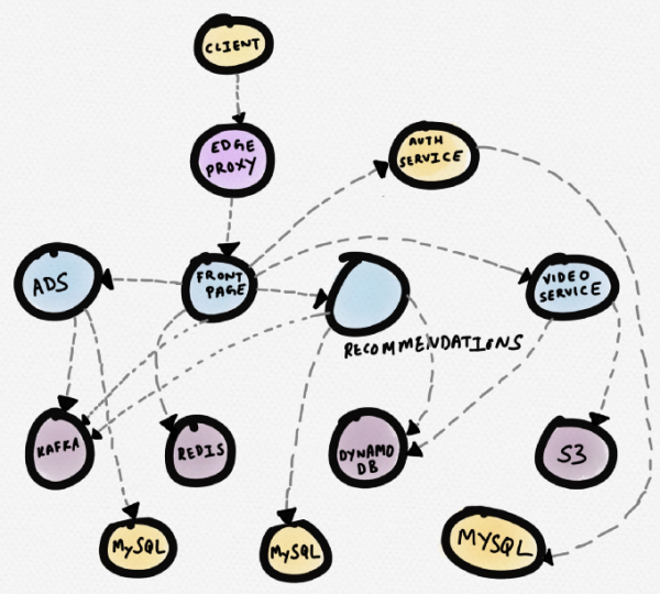
Service diagram of a hypothetical news website
A diagram shown below would be more appropriate. It places the problematic service (video) right in the center. The user notices it immediately. From this visualization, it becomes clear that the video service is functioning abnormally due to increased response times from S3, which affects the loading speed of part of the homepage.
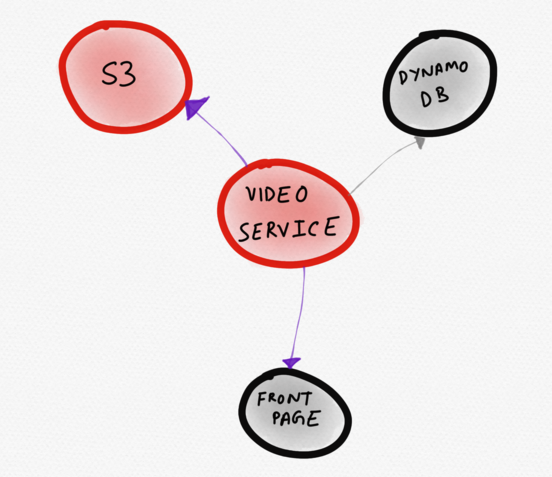
Dynamic topology displaying only "interesting" services
Dynamically generated topology diagrams can prove to be more effective than static service maps, especially in elastic, auto-scaling infrastructures. The ability to compare and match service topologies allows the user to ask more relevant questions. More precise questions about the system are more likely to lead to a better understanding of how the system works.
Comparative display
Another useful visualization would be a comparative display. Currently, traces are not very well suited for side-by-side comparison, so they are usually compared spans. The main idea of this article is that spans are too low-level to extract the most valuable information from trace results.
Comparing two traces does not require fundamentally new visualizations. In fact, something like a histogram representing the same information as traceview would be sufficient. Surprisingly, even this simple method can yield much more than just examining two traces individually. An even more powerful feature would be the ability visualize trace comparison in total. It would be extremely helpful to see how a recently deployed database configuration change with GC (garbage collection) enabled affects the response time of a downstream service over several hours. If what I'm describing here seems similar to A/B testing of the impact of infrastructure changes across multiple services using trace results, then you are not too far off the mark.
Conclusion
I do not doubt the usefulness of tracing itself. I genuinely believe there is no other method that collects as rich, casual, and contextual data as that contained in a trace. However, I also believe that all tracing solutions utilize this data extremely inefficiently. As long as tracing tools remain focused on a traceview representation, they will be limited in their ability to maximize the valuable information that can be extracted from the data contained in traces. Furthermore, there is a risk of further developing a completely unfriendly and unintuitive visual interface that greatly restricts the user's ability to debug the application.
Debugging complex systems, even with the latest tools, is incredibly challenging. Tools should assist the developer in formulating and testing hypotheses, actively providing relevant information, identifying outliers, and noting features in the distribution of latencies. For tracing to become the preferred tool for developers in debugging failures in production or addressing issues spanning various services, original user interfaces and visualizations that more closely align with the mental model of developers who create and operate these services are necessary.
Significant mental effort will be required to design a system that presents the various signals available in trace results in a way optimized for facilitating analysis and conclusions. It is necessary to consider how to abstract the system's topology during debugging to help the user overcome blind spots without having to delve into individual traces or spans.
We need good abstraction and layering capabilities (especially in the UI). Ones that fit well into the hypothesis-based debugging process, where questions can be iteratively posed and hypotheses tested. They won't automatically solve all observability problems, but will help users refine their intuition and formulate more thoughtful questions. I advocate for a more thoughtful and innovative approach to visualization. There is a real opportunity here to broaden perspectives.
P.S. from the translator
Also read in our blog:
- «»;
- «»;
- «».
Source: habr.com
