


Hello, my name is Eugene, I'm a B2B team leader at Citymobil. One of the tasks of our team is to support integrations for ordering a taxi from partners, and in order to ensure a stable service, we must always understand what is happening in our microservices. And for this you need to constantly monitor the logs.
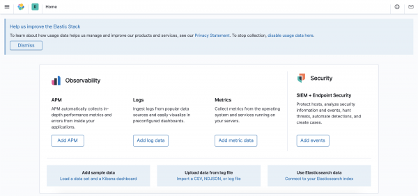
In Citymobil, we use the ELK stack (ElasticSearch, Logstash, Kibana) to work with logs, and the amount of data coming there is huge. Finding problems in this mass of requests that may appear after the deployment of new code is quite difficult. And for their visual identification, Kibana has a Dashboard section.
There are quite a few articles on Habré with examples of how to set up an ELK stack to receive and store data, but there are no relevant materials on creating a Dashboard. Therefore, I want to show how to create a visual representation of data based on incoming logs in Kibana.
Setting
To make it clearer, I created a Docker image with ELK and Filebeat. And placed in a container a small in Go, which for our example will generate test logs. I will not describe in detail the configuration of ELK, there is enough written about it on Habré.
Clone the config repository docker-compose and ELK settings, and launch it with the command docker-compose up. Intentionally not adding a key -dto see the progress of the ELK stack.
git clone https://github.com/et-soft/habr-elk
cd habr-elk
docker-compose up
If everything is configured correctly, then we will see an entry in the logs (perhaps not immediately, the process of starting a container with the entire stack may take several minutes):
{"type":"log","@timestamp":"2020-09-20T05:55:14Z","tags":["info","http","server","Kibana"],"pid":6,"message":"http server running at http://0:5601"}
By the address localhost:5061 Kibana should open.

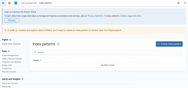
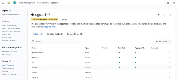
The only thing we need to configure is to create an Index Pattern for Kibana with information about what data to display. To do this, we will execute a curl request or perform a series of actions in the graphical interface.
$ curl -XPOST -D- 'http://localhost:5601/api/saved_objects/index-pattern'
     -H 'Content-Type: application/json'
     -H 'kbn-xsrf: true'
     -d '{"attributes":{"title":"logstash-*","timeFieldName":"@timestamp"}}'
Creating an Index Pattern via the GUI
To configure, select the Discover section in the left menu, and get to the Index pattern creation page.
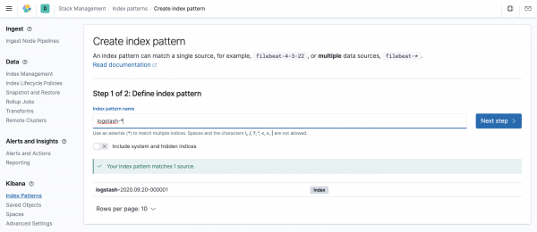
By clicking on the "Create index pattern" button, we get to the index creation page. In the "Index pattern name" field, enter "logstash-*". If everything is configured correctly, below Kibana will show the indexes that fall under the rule.
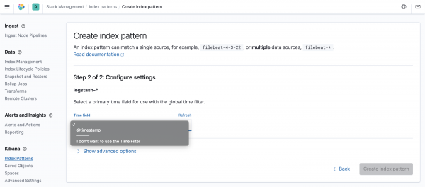
On the next page, select the key field with a timestamp, in our case it is @timestamp.
This will bring up the index settings page, but no further action is required from us at this time.
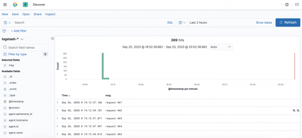
Now we can go to the Discover section again, where we will see the log entries.
Dashboard
In the left menu, click on the Dashboard creation section and get to the corresponding page.
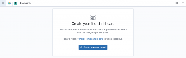
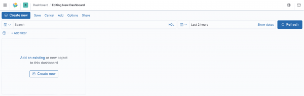
Click on "Create new dashboard" and get to the page for adding objects to the Dashboard.
Click on the "Create new" button, and the system will prompt you to select the type of data display. Kibana has a large number of them, but we will look at creating a graphical representation of the "Vertical Bar" and a tabular "Data Table". Other types of presentation are configured in a similar way.
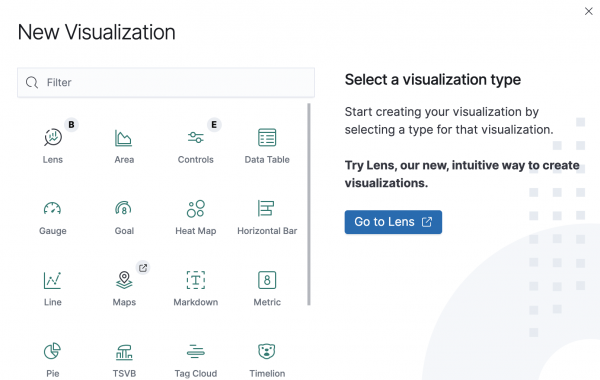
Some available objects are labeled B and E, which means that the format is experimental or in beta testing. Over time, the format may change or completely disappear from Kibana.
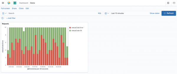
vertical bar
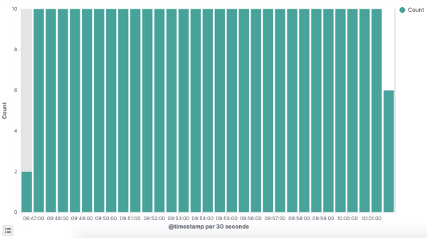
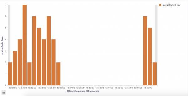
For the “Vertical Bar” example, let's create a histogram of the ratio of successful and unsuccessful response statuses of our service. At the end of the settings, we get the following graph:
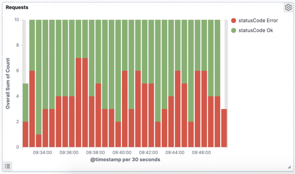
We will classify all requests with a response status < 400 as successful, and >= 400 as problematic.
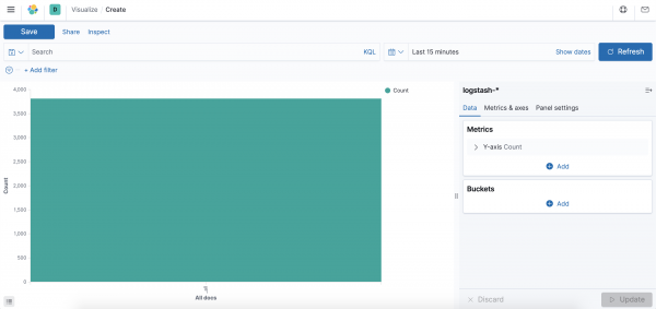
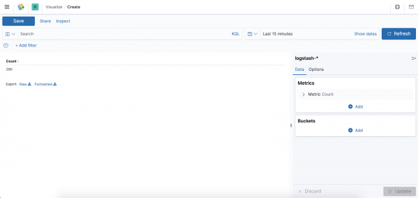
To create a "Vertical Bar" chart, we need to select a data source. Select the Index Pattern that we created earlier.
By default, a single solid graph will appear after selecting a data source. Let's set it up.
In the "Buckets" block, press the "Add" button, select "X-asis" and set up the X axis. Let's set aside the timestamps of entries in the log along it. In the "Aggregation" field, select "Date Histogram", and in the "Field" select "@timestamp", indicating the time field. Let's leave "Minimum interval" in the "Auto" state, and it will automatically adjust to our display.
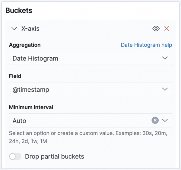
By clicking on the "Update" button, we will see a graph with the number of requests every 30 seconds.
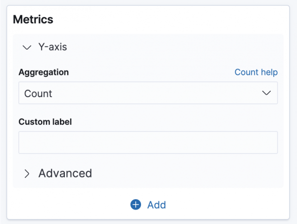
Now let's set up the columns along the Y-axis. Now we are displaying the total number of requests in the selected time interval.
Let's change the "Aggregation" value to "Sum Bucket", which will allow us to combine data for successful and unsuccessful requests. In the Bucket -> Aggregation block, select the aggregation by "Filters" and set the filtering by "statusCode >= 400". And in the "Custom label" field, we indicate our name of the indicator for a more understandable display in the legend on the chart and in the general list.
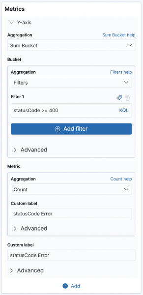
By clicking the “Update” button under the settings block, we will get a graph with problem requests.
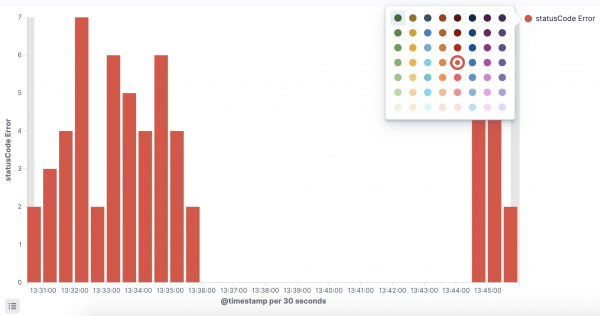
If you click on the circle next to the legend, a window will appear in which you can change the color of the columns.
Now let's add data on successful requests to the chart. In the "Metrics" section, click the "Add" button and select "Y-axis".
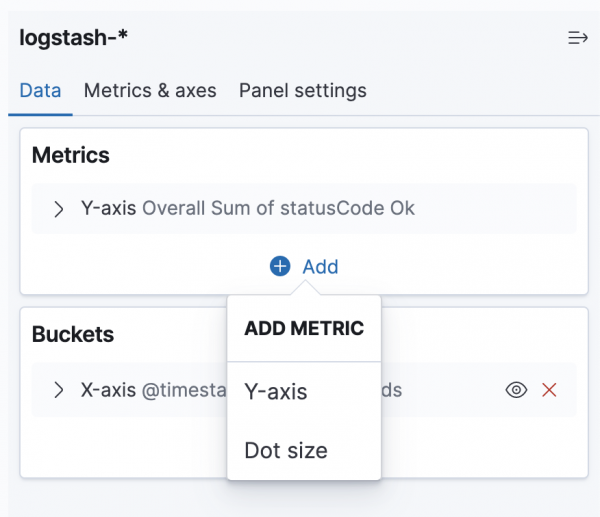
In the created metric, we make the same settings as for erroneous requests. Only in the filter we specify "statusCode < 400".

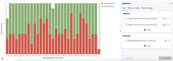
By changing the color of the new column, we get a display of the ratio of problematic and successful requests.
By clicking the “Save” button at the top of the screen and specifying the name, we will see the first chart on the Dashboard.
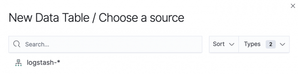
Data Table
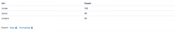
Now consider the table view "Data Table". Let's create a table with a list of all the URLs that were requested and the number of those requests. As in the Vertical Bar example, we first select a data source.

After that, a table with one column will be displayed on the screen, which shows the total number of requests for the selected time interval.
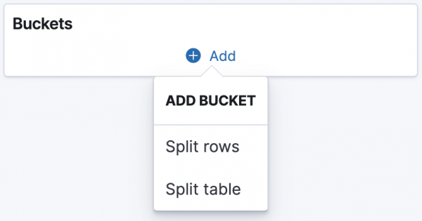
We will only change the "Buckets" block. Click the "Add" button and select "Split rows".
In the "Aggregation" field, select "Terms". And in the appeared field "Field" select "url.keyword".
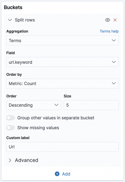
By specifying the "Url" value in the "Custom label" field and clicking "Update", we will get the desired table with the number of requests for each of the URLs for the selected period of time.
At the top of the screen, click the "Save" button again and specify the name of the table, for example Urls. Let's go back to the Dashboard and see both views created.
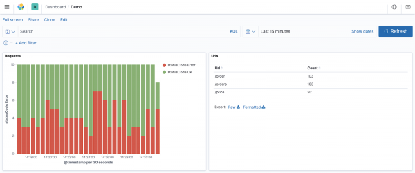
Working with Dashboard
When creating the Dashboard, we set only the main view parameters in the display object settings. It makes no sense to specify data for filters in objects, for example, “date range”, “filtering by useragent”, “filtering by request country”, etc. It is much more convenient to specify the desired time period or set the necessary filtering in the query panel, which is located above the objects.
![]()
The filters added on this panel will be applied to the entire Dashboard, and all display objects will be rebuilt in accordance with the actual filtered data.
Conclusion
Kibana is a powerful tool that allows you to visualize any data in a convenient way. I tried to show the setting of the two main types of display. But other types are configured in a similar way. And the abundance of settings that I left “behind the scenes” will allow you to very flexibly customize charts to suit your needs.
Source: habr.com
