

You may have the best open-source project, but without good documentation, it is likely to never take off. Good documentation in the office allows you to avoid answering the same questions repeatedly. It also ensures that people can understand the project if key employees leave the company or roles change. Live guidelines help maintain data integrity.
If you need to write a lengthy text, Markdown is an excellent alternative to HTML. Sometimes, Markdown's syntax is not enough. In that case, we can use HTML within it. For example, custom elements. So if you're building a design system with native web components, they can easily be included in text documentation. If you're using React (or any other JSX framework such as Preact or Vue), you can do the same using MDX.
This article is a broad overview of tools for writing documentation and creating guidelines. Not all tools listed here use MDX, but it is increasingly being included in documentation tools.
What is MDX?
File .mdx has the same syntax as Markdown but allows you to import interactive JSX components and embed them in your content. Support for Vue components is in alpha. To get started with MDX, simply install 'Create React App'. There are plugins for Next.js and Gatsby. The next version of Docusaurus (version 2) will also have built-in support.
Writing Documentation with Docusaurus
Docusaurus was created by Facebook. They use it for every open-source project except React. Outside the company, it is used by Redux, Prettier, Gulp, and Babel.
 Projects that use Docusaurus.
Docusaurus can be used for writing any documentation, not only for describing the frontend. It is built on React, but you don't need to be familiar with it to use it. It takes your Markdown files, a pinch of magic, and you have well-structured, formatted, and readable documentation with a beautiful design ready.
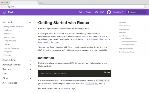
You can view the standard Docusaurus template on the Redux website.
Websites created using Docusaurus can also include a blog based on Markdown. Prism.js is integrated for syntax highlighting right away. Despite Docusaurus being relatively new, it was recognized as the best tool of 2018 on StackShare.
Other content creation options
Docusaurus is specifically designed for creating documentation. Of course, there are a million and one ways to make a site — you can deploy your own solution in any language, CMS, or use a static site generator.
For example, the documentation for React, IBM's design system, Apollo, and Ghost CMS uses Gatsby — a static site generator often used for blogs. If you're working with Vue, VuePress is a great option. Another alternative is to use a generator written in Python — MkDocs. It is open-source and configured with a single YAML file. GitBook is also a good choice, but it's free only for open and non-commercial teams. You can also simply upload markdown files using git and work with them on GitHub.
Documenting components: Docz, Storybook, and Styleguidist
Guidelines, design systems, component libraries — whatever you call them, they've become quite popular lately. The emergence of component frameworks like React and the tools mentioned here has allowed them to evolve from vanity projects into useful tools.
Storybook, Docz, and Styleguidist all do the same thing: display interactive elements and document their APIs. A project can have dozens or even hundreds of components — all with various states and styles. If you want components to be reused, people need to know they exist. Cataloging the components is sufficient for this. Guidelines provide a searchable overview of all your components. This helps maintain visual consistency and avoids redundant work.
These tools provide a convenient way to view various states. It can be challenging to reproduce every state of a component in the context of a real application. Instead of clicking through a real app, it is advisable to develop a separate component. You can model hard-to-reach states (for example, a loading state).
Alongside the visual demonstration of various states and a list of properties, it is often necessary to write a general description of the content — design rationales, use cases, or descriptions of user testing results. Markdown is very easy to learn — ideally, the guidelines should be a shared resource for designers and developers. Docz, Styleguidist, and Storybook provide a way to easily mix Markdown with components.
Docz
Currently, Docz only works with React, but active work is underway to support Preact, Vue, and web components. Docz is the freshest of the three tools, having gathered over 14,000 stars on GitHub. Docz features two components — <Playground> and < Props >. They are imported and used in files .mdx.
import { Playground, Props } from "docz";
import Button from "..\/src\/Button";
## You can _write_ **markdown**
### You can import and use components
You can wrap your own React components with <Playground>, to create a feature similar to the built-in CodePen or CodeSandbox — meaning you can see your component and edit it.
<Props> will show all available properties for this React component, default values, and whether the property is required.
<Props of={Button} />Personally, I find this MDX-based approach the easiest to understand and work with.
If you are a fan of the Gatsby static site generator, Docz offers great integration.
Styleguidist
As with Docz, examples are written using Markdown syntax. Styleguidist uses Markdown code blocks (triple quotes) in regular files .md files, not in MDX.
```js
Code blocks in Markdown typically just show code. When using Styleguidist, any code block with a language tag js, jsx or javascript will be displayed as a React component. As with Docz, the code is editable — you can change properties and see the results instantly.
Styleguidist will automatically create a properties table from PropTypes, Flow, or TypeScript declarations.
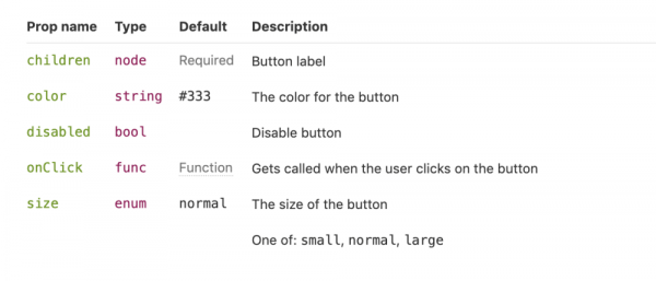
Styleguidist currently supports React and Vue.
Storybook
Storybook positions itself as a "UI components development environment." Instead of writing examples of components inside Markdown or MDX files, you write stories inside JavaScript files. History document specific states of a component. For example, a component may have stories for loading state and disabled state (disabled).
storiesOf('Button', module)
.add('disabled', () => (
))Storybook is much more complex than Styleguidist and Docz. However, it is the most popular option, with over 36,000 stars on GitHub. It is an open-source project involving 657 contributors and maintained by core staff. It is used by Airbnb, Algolia, Atlassian, Lyft, and Salesforce. Storybook supports more frameworks than its competitors—React, React Native, Vue, Angular, Mithril, Ember, Riot, Svelte, and plain HTML.
Future releases will include features from Docz and implement MDX.
# Button

Some _notes_ about your button written with **markdown syntax**.

<Story name="disabled">
  <Button disabled>lorem ipsum</Button>
</Story>
New features of Storybook will be rolled out gradually over the next several months, and it seems that this will be a significant step forward.
Summary
The advantages of pattern libraries are celebrated in millions of articles on Medium. When done well, they simplify the creation of related products and maintain identity. Of course, none of these tools magically create a design system. This requires careful design and CSS planning. But when it's time to make a design system accessible company-wide, Docz, Storybook, and Styleguidist are excellent options.
From the translator. This is my first experience on Habr. If you found any inaccuracies or have suggestions for improving the article, feel free to message me.
Source: habr.com
