

This article is a brief overview of the book Game Interface Design by the author Brent Fox. For me, this book was interesting from the perspective of a programmer who develops games as a hobby on their own. Here, I will describe how useful it was for me and my hobby.

This review will help you decide whether it's worth spending your resources on it. In the comments, you might find references to other useful books on game interfaces by more knowledgeable and kind colleagues.
Relevance
The book was published in 2004. Therefore, it contains clearly outdated descriptions and recommendations. For example, a PC resolution of 1024×768 is referred to as 'very high resolution.' Additionally, the author suggests using Flash for creating interactive interface mockups. Although Flash is no longer a popular technology, it might still be a good solution for quickly creating mockups.
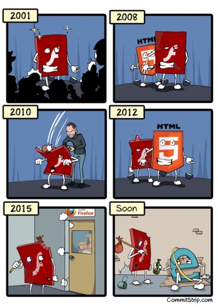
A Brief History of Adobe Flash []
The main ideas and advice in the book still seem relevant, and the materials can be considered useful. It was nice to encounter the now rarely used meticulous approach of minimizing graphical data so that a game would fit on a DVD (or even a CD) rather than taking up around 60 GB.
Due to the years that have passed, the book cannot be called a Must Have. Nevertheless, it can be useful; for me, it was.
Target Audience
The book is mainly aimed at beginner game designers—interface developers working in a team with programmers, artists, management, and clients/publishers. For experienced designers, it might not be very useful (also judging by reviews in online stores). The primary development platform discussed is consoles, followed by PCs. Smartphones (and especially VR) are not considered, as it would still be three years before their explosive popularity with the launch of the iPhone.
For minimal indie teams, the advice will also be very interesting. The book is written in an easy and engaging manner. I read it in English and did not find any convoluted or inappropriate phrases—everything was straightforward and to the point. It took me 16 hours to read and take notes. The last two chapters describe the basics of working in Photoshop and Macromedia Flash, but they can be skipped.
Noted ideas from the book
Now, as I read books, I take separate notes of the brief summaries of the suggested instructions and advice. Overall, I have highlighted 63 summaries for myself. I will provide a few of these summaries next.
14. If you have a super cool and creative idea for a game interface, it’s worth examining it thoroughly (this includes control methods in the game). It’s possible that it has already been attempted, but there were very good reasons to abandon it. And it’s not guaranteed that these issues can be resolved now (or even if it’s worth the effort). A new interface and controls could become a unique feature of the game, but they could also make it inconvenient and confusing.
18. A Fresh Perspective. To view your work anew, you need to change how you "receive" it. For example: try a different device; replace texts with rectangles; adjust the scale; turn it upside down; step back from the desk or view it from the side.
21. The gaps between shapes visually differ from actual distances. Rectangular shapes require more space than circular ones to appear as if they are at an "equal" distance from each other.

Cognitive biases in user interfaces. [] This article explores the topic in more detail, although it is more aimed at web designers.
The point is that the actual distances between symbols/shapes may be the same, yet the perceived distances can be significantly distorted.
24. The Effect of Motion. Even static elements can convey a sense of movement. For example, diagonal lines receding into the distance.
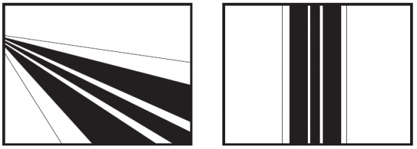
Vertical and horizontal lines, on the other hand, give a sense of stability and balance to the image.
32. Intersection of Objects. Objects should either fit snugly together or noticeably overlap.
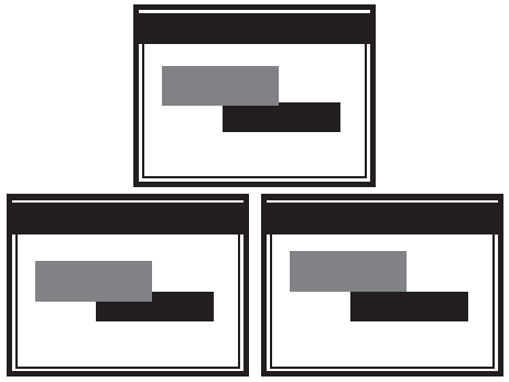
With a slight overlap, it appears as though the designer attempted to align them closely, but it didn’t work out, resulting in an awkward overlay.
46. Animations in the interface should be quick, usually no longer than a second. Moreover, there should be an option to skip them entirely for an immediate transition to the next screen or control element. Cool animations are only interesting the first couple of times; afterwards, they become dull. If they are too long, they will only irritate. However, if they are short, they become almost unnoticed, which is rather an advantage than a drawback for the interface.
49-51. About icons. Buttons and indicators in the form of icons are perceived by players much more quickly than text and numbers. Therefore, it is recommended to choose understandable icons as often as possible.
Icons can be grouped by their purpose. For example, attack buttons should be red, settings buttons (sound, resolution) should be blue, and construction buttons should be silver... This allows players to find the necessary button more quickly, instantly filtering out unnecessary groups from their search area.
Icons should adhere to the principle of consistency. For instance, if a red pentagon or circle is used for the Stop sign in one place, a black square from audio players should not be used in another. This principle should also be applied to color grouping. One should not change the colors of identical icons in different menu windows.
Like any graphics, icons must be handled carefully to avoid copyright issues. Therefore, it is safer to create your versions of icons 'inspired' by another game. However, this can also lead to issues.
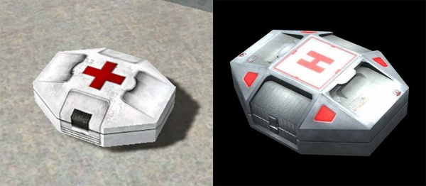
For example, using a red cross on a white background in first aid kits (and other elements) is prohibited, and you may be 'politely sued.' This is periodically done by the organization 'Red Cross,' as detailed in the article 'Unexpected Reaction: The Red Cross Demands Removal of Its Symbol from the Game Prison Architect' []
55. Dynamic elements in the HUD (in-game, 'always' active interface). It's necessary to analyze the need to display all information in the HUD — should it really always be visible and accessible, or just in specific states? For example, in strategy games, health bars of fully healthy characters are often hidden, showing them only in case of injuries.
In some cases, incomplete health bars may be hidden and displayed only for a couple of seconds right after they change (such as when healing or taking damage). Alternatively, health bars might only show in combat mode, hiding them while wandering and searching for combat triggers.
About the Author
Brent Fox. At the time of writing the book, he had worked in the gaming industry for 7 years as a project manager and art director (he was 34 years old then). He managed teams of up to 27 people and worked with very budget games. He developed games for various consoles. He worked in studios: Bla-Dam Studios, Furious Games. []
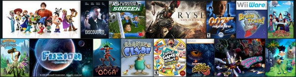
Currently, the author works as an art director at Wahoo Studios []. They primarily develop console games under contract with Microsoft and Electronic Arts.
Conclusion
In my opinion, the book can be quite useful. However, one cannot ignore the significant number of negative reviews — the book is criticized for its overly basic/simplistic approach lacking specialized nuances. Moreover, it has noticeably become outdated. It would be great if more experienced readers could recommend other books on this topic in the comments: better and/or more relevant.
Links to sources and additional literature
1.
2.
3.
4.
5.
Source: habr.com
