

Indie developers often have to juggle multiple roles: game designer, programmer, composer, artist. And when it comes to visuals, many choose pixel art — it seems simple at first glance. However, creating something beautiful requires a lot of experience and specific skills. I found a tutorial for those who are just starting to grasp the basics of this style, including descriptions of special software and drawing techniques with examples of two sprites.
Background
Pixel art is a form of digital artistic expression where modifications are made at the pixel level. It is mainly associated with video game graphics from the 80s and 90s. Back then, artists had to consider memory limitations and low resolution. Nowadays, pixel art remains popular in games and as an artistic style overall, despite the possibility of creating realistic 3D graphics. Why? Even if we set nostalgia aside, creating impressive work within such strict constraints is a rewarding and enjoyable challenge.
The entry barrier for pixel art is relatively low compared to traditional art and 3D graphics, which attracts indie developers. But that doesn't mean it will be easy to finish a game in this style. I've seen many indie developers with pixel art metroidvanias on crowdfunding platforms. They thought they would finish it all in a year, but in reality, they needed about six more years.
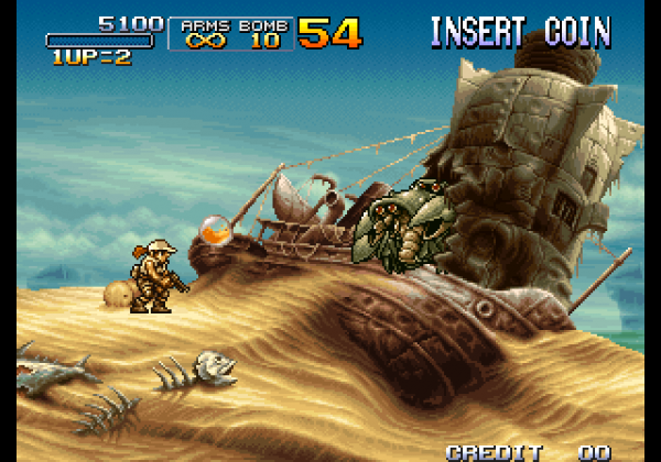
Metal Slug 3 (Arcade). SNK, 2000
Creating pixel art at the level that most want to achieve takes a lot of time, and there are very few concise tutorials available. When working with a 3D model, you can rotate it, deform it, move its individual parts, copy animations from one model to another, and so on. High-level pixel art almost always requires a great deal of effort to meticulously place pixels on every frame.
In short, I warned you.
Now, a bit about my style: I mainly draw pixel art for video games and find inspiration in them. In particular, I am a fan of Famicom/NES, 16-bit consoles, and arcade games from the 90s. The pixel art of my favorite games from that time can be described as bright, confident, and clean (but not too much); it cannot be characterized as harsh or minimalist. This is the style I work in myself, but you can easily apply ideas and techniques from this tutorial to create entirely different things. Study the works of various artists and create pixel art that you enjoy!
Software
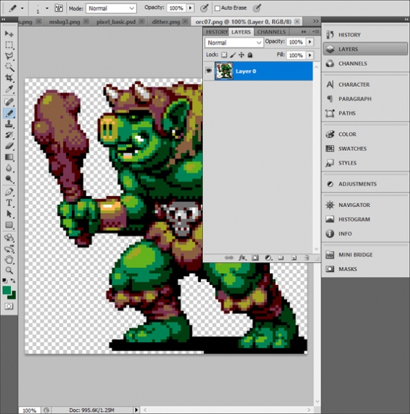
The basic digital tools for pixel art are Zoom and Pencil to place pixels. Line, Shape, Select, Move, and Paint Bucket will also come in handy. There are many free and paid software options with such a toolkit. I will talk about the most popular ones and those I use myself.
Paint (free)
If you have Windows, the built-in Paint is a primitive program, but it has all the tools needed for pixel art.
(free)
Surprisingly functional pixel art editor that runs through your browser. You can export your work as PNG or animated GIF. A great option for beginners.
(free)
GraphicsGale is the only editor I've heard of that was specifically designed for pixel art and includes animation tools. It was created by a Japanese company called HUMANBALANCE. Since 2017, it has been available for free and continues to be in demand, despite the rising popularity of Aseprite. Unfortunately, it only works on Windows.
($)
Arguably the most popular editor at the moment. , a ton of features, active support, versions for Windows, Mac, and Linux. If you're serious about pixel art and still haven't found the right editor, this might be what you need.
($$+)
GameMaker Studio 2 is an excellent 2D tool with a good sprite editor. If you want to create pixel art for your own games, it's very convenient to do everything in one program. Right now, I'm using this software in my work on , a collection of 50 retro games: I create sprites and animations in GameMaker, while tilesets are created in Photoshop.
($$$+)
Photoshop is expensive software available via subscription and not designed for pixel art. I don't recommend purchasing it unless you are working on high-resolution illustrations or need to perform complex manipulations of images, like I do. You can create static sprites and pixel art in it, but it is quite complex compared to specialized software (such as GraphicsGale or Aseprite).
Other
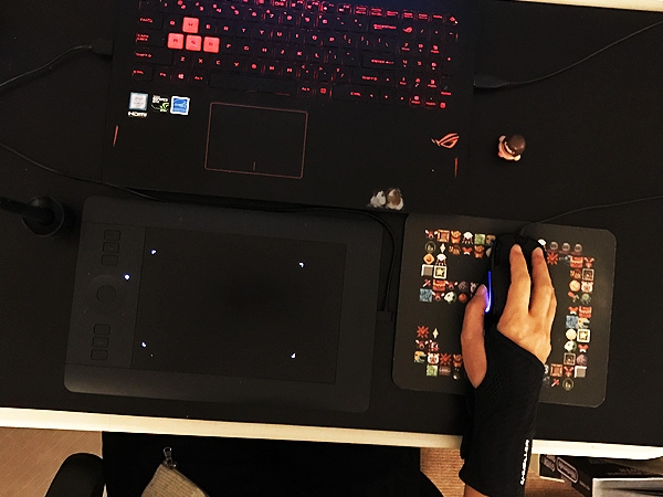
My pixel art setup. It's all black; I just noticed that now.
Graphic tablet ($$+)
I recommend graphic tablets for any work with digital illustrations to avoid wrist tunnel syndrome. It's much easier to prevent than to treat. Once you feel pain, it will only escalate — take care of yourself from the start. Because I once drew with a mouse, I now struggle to play games that require pressing buttons. I currently use a Wacom Intuos Pro S.
Wrist support ($)
If you can't afford a tablet, at least get a wrist support. My favorite is the Mueller Green Fitted Wrist Brace. The others are either too tight or provide inadequate support. Supports can be easily ordered online.
96×96 pixels
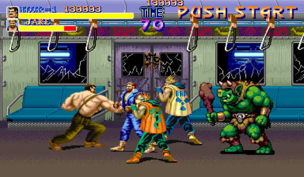
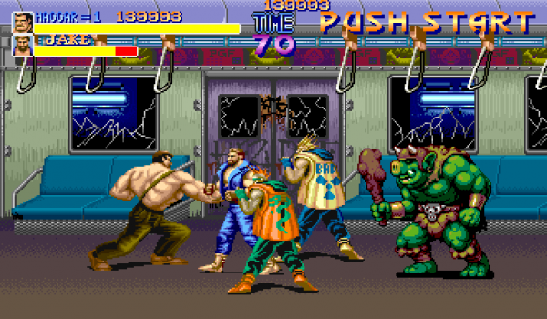
Final Fight. Capcom, 1989
Let's get started! We'll begin with a character sprite of 96×96 pixels. For example, I've drawn an orc and placed it on a screenshot from Final Fight (the image above) so you can understand the scale. This is a large sprite for most retro games, screenshot size: 384×224 pixels.
With such a large sprite, it will be easier to demonstrate the technique I want to explain. Additionally, pixel art closely resembles traditional forms of art (such as drawing or painting) that you may be more familiar with. Once we master the basic techniques, we will move on to smaller sprites.
1. Choose a palette
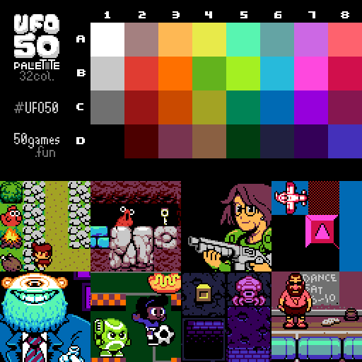
A pixel is a much deeper concept in pixel art than in any other digital sphere. Pixel art is defined by its limitations, such as colors. It's important to choose the right palette; it will help define your style. But at the start, I recommend not thinking about palettes and opting for one of the existing ones (or just a few random colors) — you can easily change it at any stage.
For this tutorial, I will use a palette of 32 colors that we created for . Pixel art often consists of 32 or 16 colors. Ours is designed for a fictional console that could appear somewhere between the Famicom and the PC Engine. You can use it or any other palette — the tutorial is not dependent on the chosen palette at all.
2. Rough Outlines
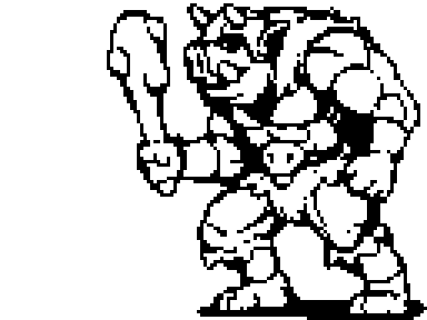
Let's start sketching with the Pencil tool. We'll draw the sketch just like we do with a regular pen and paper. Of course, pixel art and traditional art intersect, especially when it comes to larger sprites. My observations show that strong pixel artists at least have decent drawing skills, and vice versa. So developing drawing skills is always beneficial.
3. Refining the Outlines
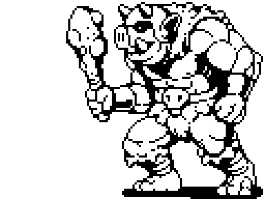
We refine the outlines: removing unnecessary pixels and reducing the thickness of each line to one pixel. But what exactly do we consider unnecessary? To answer this question, we need to understand pixel lines and irregularities.
Irregularities
You need to learn to draw two basic types of lines in pixel art: straight and curved. With a pen and paper, it all comes down to muscle control, but we are working with tiny colored blocks.
The key to drawing the right pixel lines is irregularities. These are single pixels or small segments that disrupt the smoothness of a line. As I mentioned before, a single pixel is incredibly important in pixel art, so irregularities can break the whole aesthetic. Imagine drawing a straight line on paper and suddenly someone bumps the table: irregularities in pixel art look just like a random squiggle.
Examples:
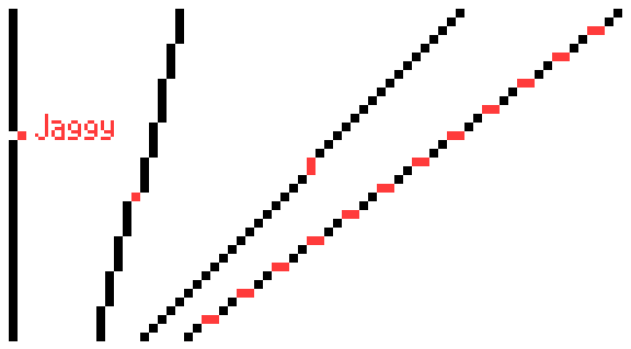
Straight
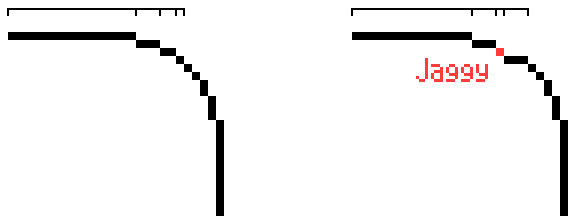
Curved
Irregularities appear on curves when the segment lengths of the line increase or decrease unevenly.
You cannot completely avoid irregularities — they exist in all your favorite retro games (unless, of course, the pixel art consists solely of simple shapes). The goal: minimize irregularities while showing everything necessary.
4. Applying the First Colors
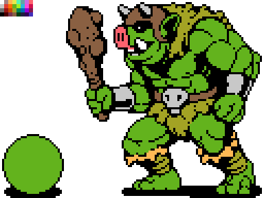
Color your character using fill or another appropriate tool. The palette will make this part of the work easier. If the software does not support palettes, you can place it directly in the image, as shown in the example above, and pick colors using the eyedropper.
In the lower left corner, I drew our friend, meet Shar. It will be easier to understand what is happening at each stage with him.
5. Shading
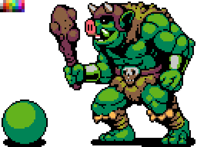
It's time to depict shadows — simply add darker colors to the sprite. This will give the image a three-dimensional look. Let's assume we have one light source located above the orc, to the left of him. This means everything above and in front of our character will be illuminated. We add shadows to the bottom right.
Shape and Volume
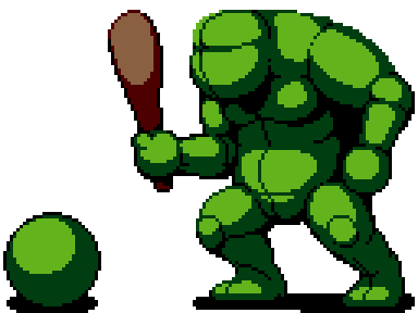
If this stage is challenging for you, imagine your drawing as three-dimensional shapes rather than just lines and color. Shapes exist in three-dimensional space and can have volume, which we build up using shadows. This will help visualize the character without details and allow you to think of it as being made of clay rather than pixels. Shading is not just about adding new colors; it's a process of developing form. On a well-crafted character, details do not obscure the basic shapes: if you squint, you'll see several large clusters of light and shadow.
Anti-aliasing
Every time I use a new color, I apply anti-aliasing (AA). It helps smooth out pixels by adding intermediate colors at the edges where two segments of a line meet:
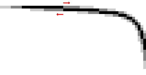
Gray pixels soften the 'breaks' in the line. The longer the line segment, the longer the AA segment.
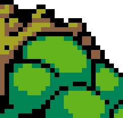
This is how AA looks on the orc's shoulder. It is needed to smooth out the lines showing the curvature of his muscles.
Anti-aliasing should not extend beyond the sprite that will be used in the game or against a background of unknown color. For example, if you apply AA for a light background, on a dark background the anti-aliasing will look unattractive.
6. Selective Outline
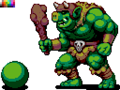
Previously, outlines were completely black, which made the sprite look very cartoonish. The image seemed divided into segments. For example, the black lines on the arm contrast too sharply with the musculature, making the character appear less cohesive.
If the sprite becomes more natural and the segmentation less obvious, the basic forms of the character will be easier to read. To achieve this, you can use selective outlining—partially replacing the black outline with a lighter one. On the illuminated part of the sprite, you can use the lightest colors or, where the sprite touches the negative space, you can completely remove the outline. Instead of black, use the color chosen for the shadow—this helps maintain segmentation (to distinguish muscles, fur, and so on).
At this stage, I also added darker shadows. There are three shades of green on the orc's skin. The darkest green color can be used for selective outlining and AA.
7. Final Touches
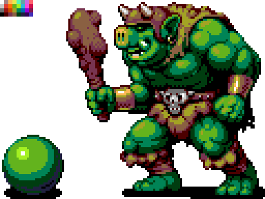
In the end, it's worth adding highlights (the brightest spots on the sprite), details (earrings, studs, scars), and other enhancements until the character is ready or until it's necessary to move on to the next.
There are several useful techniques that can be applied at this stage. Flip the drawing horizontally; this often helps identify errors in proportions and shading. You can also remove color—set saturation to zero—to understand where shadows need to be adjusted.
Creating Noise (Dithering)
So far, we have mainly used large, solid areas of shadows. But there is another technique—dithering—that allows for a transition from one color to another without adding a third. Look at the example below.
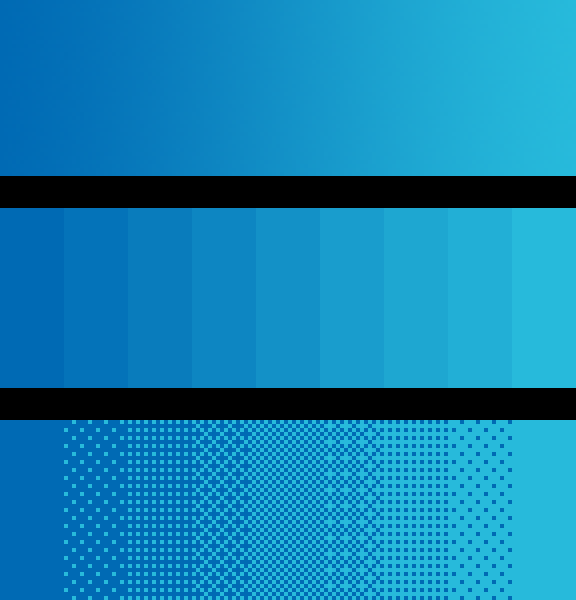
The upper gradient from dark to light uses hundreds of different shades of blue.
The middle gradient uses only nine colors, but it still has too many shades of one color. This phenomenon is known as banding, where, due to thick uniform stripes, the eye focuses on the color intersections rather than the colors themselves.
In the lower gradient, we applied dithering, which helps avoid banding and uses only two colors. We create noise of varying intensity to simulate color gradation. This technique is very similar to halftoning used in printing, as well as stippling in illustration and comics.
On the orc, I used dithering only a little for texture transmission. Some pixel artists don't use it at all, while others, on the contrary, are quite skilled at it. I think dithering looks best on large areas filled with a single color (take a look at the sky in the screenshot of Metal Slug above) or in parts that should appear rough and uneven (like dirt). Decide for yourself how to use it.
If you want to see an example of large-scale and high-quality dithering, check out games by The Bitmap Brothers, a British studio from the 80s, or titles for the PC-98 computer. Just keep in mind that they are all NSFW.
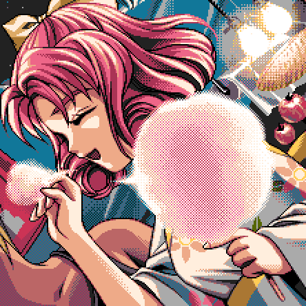
Kakyusei (PC-98). Elf, 1996.
This image contains just 16 colors!
8. A Final Look
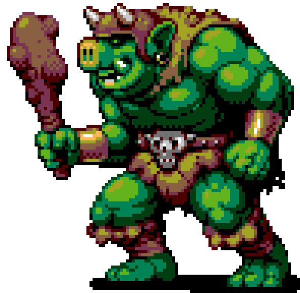
One of the dangers of pixel art is that it seems easy and simple (due to its structure and the style's limitations). But in the end, you will spend a tremendous amount of time refining your sprites. It's like a puzzle to be solved — which is why pixel art attracts perfectionists. Remember, one sprite shouldn't take too long — it's just a tiny piece of an extremely complex assembly of pieces. It's important not to lose sight of the big picture.
Even if your pixel art isn't for games, sometimes it's worth telling yourself, 'It's already good enough!' and moving on. The best way to develop skills is to go through the entire process from start to finish as many times as possible, using as many themes as you can.
And sometimes it's useful to step away from a sprite for a while to take a fresh look at it later.
32×32 pixels
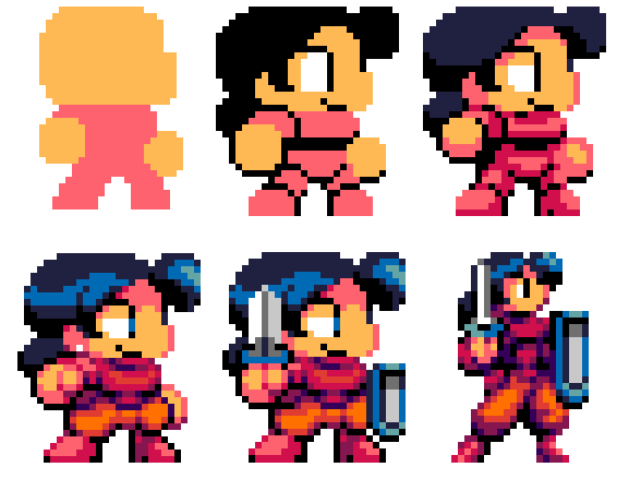
We created a large sprite of 96×96 pixels first because at that size, it feels more like drawing or painting, just with pixels. The smaller the sprite, the less it resembles what it should depict, and the more significant each pixel becomes.

In Super Mario Bros., Mario's eye consists of just two pixels, stacked one above the other. His ear is the same. The character's creator, Shigeru Miyamoto, said that the mustache was needed to separate the nose from the rest of the face. Thus, one of Mario's defining features is not just character design, but a pragmatic trick. This supports the old saying — 'necessity is the mother of invention.'
The main stages of creating a 32×32 pixel sprite are already familiar to us: sketching, coloring, shading, and further refinement. But under such conditions, as an initial sketch, I choose colored shapes instead of outlining due to the small size. Color plays a more crucial role in defining the character than outlines. Take another look at Mario; he has no outlines at all. It's not just the mustache that's interesting. His sideburns define the ears' shape, the sleeves show the arms, and the overall shape fairly clearly represents his entire body.
Creating small sprites involves constant compromises. If you add an outline, you might lose space for shading. If your character has clearly defined arms and legs, their head is likely to be not very large. If you use color effectively, along with selective outlining and smoothing, the drawn object will appear larger than it actually is.
For small sprites, I like the chibi style: characters look very cute, with large heads and eyes. It's a great way to create a vibrant hero in limited space, and overall, it's a very pleasant style. However, if you need to show the character's mobility or strength, you might want to allocate less space for the head, so the body looks more powerful. It all depends on your preferences and goals.
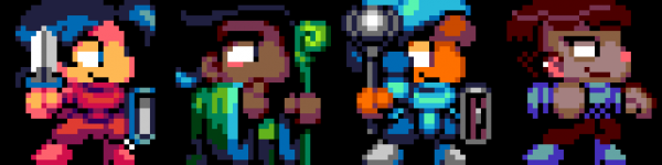
The whole team is gathered!
File formats
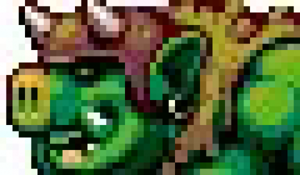
Such a result can make any pixel artist nervous.
The image you're seeing is the result of saving the drawing in JPG. Some data was lost due to the file compression algorithms. Quality pixel art will ultimately look poor, and restoring its original palette will be challenging.
To save a static image without quality loss, use the PNG format. For animations, use GIF.
How to properly share pixel art
Sharing pixel art on social media is a great way to get feedback and connect with other artists working in the same style. Don't forget to use the hashtag #pixelart. Unfortunately, social networks often convert PNG to JPG without asking, degrading your work. It’s not always clear why your image was converted.
Here are some tips on how to maintain pixel art in the right quality for various social media.
To prevent a PNG file from changing in Twitter, use fewer than 256 colors or , that your file is less than 900 pixels on its longest side. I would suggest increasing the file size to at least 512×512 pixels, while ensuring that the scaling is in multiples of 100 (200%, not 250%) and that sharp edges are preserved (Nearest Neighbor in Photoshop).
Animated GIF files for posts on Twitter should not exceed 15 MB. The image should be at least 800×800 pixels, the looping animation should repeat three times, and the last frame should last half as long as all the others — this is the most popular theory. However, it is unclear how important it is to meet these requirements, considering that Twitter is constantly changing its image display algorithms.
As far as I know, it's impossible to post an image on Instagram without losing quality. But it will definitely look better if you increase it to at least 512×512 pixels.
Source: habr.com
