

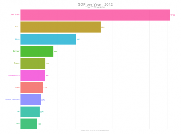
Animated histograms that can be embedded directly into publications on any website are becoming increasingly popular. They visually display the dynamics of changes in various characteristics over time. Let's see how to create them using R and universal packages.
Skillbox recommends: Practical Course .
Reminder: for all readers of 'Habr' - a discount of 10,000 rubles when enrolling in any Skillbox course with the promo code 'Habr'.
Packages
We need the following packages in R:
- ggplot2
These two are essential. Additionally, tidyverse, janitor, and scales will be needed for data management, cleaning the dataset, and formatting respectively.
Data
The original dataset we will use for this project is downloaded from the World Bank website. Here they are — . The same data, if you need it in a ready-to-use format, can be downloaded from the .
What kind of information is this? The sample contains the GDP values of most countries over several years (from 2000 to 2017).
Data processing
We will use the code provided below to prepare the necessary data format. We clear the column names, convert numbers to numeric format, and transform the data using the gather() function. Everything obtained is saved as gdp_tidy.csv for further use.
library(tidyverse)
 library(janitor)
gdp <- read_csv("./data/GDP_Data.csv")
#select required columns
gdp % select(3:15)
#filter only country rows
gdp <- gdp[1:217,]
gdp_tidy %
mutate_at(vars(contains("YR")), as.numeric) %>%
gather(year, value, 3:13) %>%
janitor::clean_names() %>%
mutate(year = as.numeric(stringr::str_sub(year, 1, 4)))
write_csv(gdp_tidy, "./data/gdp_tidy.csv")
Animated Histograms
Creating them requires two stages:
- Building a complete set of relevant histograms using ggplot2.
- Animating static histograms with desired parameters using gganimate.
The final step is rendering the animation in the desired format, including GIF or MP4.
Loading Libraries
- library(tidyverse)
- library(gganimate)
Data Management
At this stage, we need to filter the data to get the top 10 countries for each year. We'll add some columns to display the legend for the histogram.
gdp_tidy <- read_csv("./data/gdp_tidy.csv")
gdp_formatted %
group_by(year) %>%
# The * 1 makes it possible to have non-integer ranks while sliding
mutate(rank = rank(-value),
Value_rel = value / value[rank == 1],
Value_lbl = paste0(" ", round(value / 1e9))) %>%
group_by(country_name) %>%
filter(rank %
ungroup()
Building Static Histograms
Now that we have the dataset in the required format, we start drawing static histograms. The basic information is the top 10 countries with the highest GDP over the selected time interval. We create charts for each year.
staticplot = ggplot(gdp_formatted, aes(rank, group = country_name,
 fill = as.factor(country_name), color = as.factor(country_name))) +
 geom_tile(aes(y = value / 2,
 height = value,
 width = 0.9), alpha = 0.8, color = NA) +
 geom_text(aes(y = 0, label = paste(country_name, " ")), vjust = 0.2, hjust = 1) +
 geom_text(aes(y = value, label = Value_lbl, hjust = 0)) +
 coord_flip(clip = "off", expand = FALSE) +
 scale_y_continuous(labels = scales::comma) +
 scale_x_reverse() +
 guides(color = FALSE, fill = FALSE) +
 theme(axis.line = element_blank(),
 axis.text.x = element_blank(),
 axis.text.y = element_blank(),
 axis.ticks = element_blank(),
 axis.title.x = element_blank(),
 axis.title.y = element_blank(),
 legend.position = "none",
 panel.background = element_blank(),
 panel.border = element_blank(),
 panel.grid.major = element_blank(),
 panel.grid.minor = element_blank(),
 panel.grid.major.x = element_line(size = .1, color = "grey"),
 panel.grid.minor.x = element_line(size = .1, color = "grey"),
 plot.title = element_text(size = 25, hjust = 0.5, face = "bold", colour = "grey", vjust = -1),
 plot.subtitle = element_text(size = 18, hjust = 0.5, face = "italic", color = "grey"),
 plot.caption = element_text(size = 8, hjust = 0.5, face = "italic", color = "grey"),
 plot.background = element_blank(),
 plot.margin = margin(2, 2, 2, 4, "cm"))
Creating graphs using ggplot2 is quite simple. As you can see in the code snippet above, there are a few key points with the theme() function. They are essential for ensuring that all elements are animated smoothly. Some of them can be hidden if needed. For example, only the vertical grid lines and legends are displayed, while the axis titles and a few additional components are removed from the plot.
Animation
The key function here is transition_states(), which stitches together individual static graphs. The function view_follow() is used to render the grid lines.
anim = staticplot + transition_states(year, transition_length = 4, state_length = 1) +
 view_follow(fixed_x = TRUE) +
 labs(title = 'GDP per Year : {closest_state}',
 subtitle = "Top 10 Countries",
 caption = "GDP in Billions USD | Data Source: World Bank Data")
Rendering
Once the animation is created and saved in the anim object, it’s time to visualize it using the animate() function. The renderer used in animate() can vary depending on the type of output file required.
GIF
# For GIF
animate(anim, 200, fps = 20, width = 1200, height = 1000,
renderer = gifski_renderer("gganim.gif"))
MP4
# For MP4
animate(anim, 200, fps = 20, width = 1200, height = 1000,
renderer = ffmpeg_renderer()) -> for_mp4
anim_save("animation.mp4", animation = for_mp4)
Result
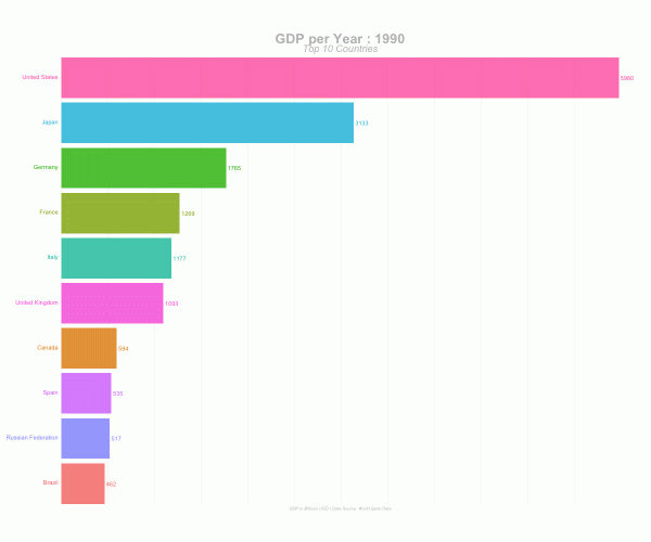
As we can see, there’s nothing complicated. The entire project is available on , feel free to use it as you see fit.
Skillbox recommends:
- Two-Year Practical Course .
- Online Course .
- Practical Year Course .
Source: habr.com
