

The reporting time in Excel is rapidly fading — the trend towards convenient tools for presenting and analyzing information is evident across all sectors. We have long discussed the digitalization of reporting and chosen the visualization and self-service analytics system Tableau. Alexander Bezugly, head of the analytics solutions and reporting department at the M.Video-Eldorado Group, shared his experience and the outcomes of building the operational dashboard.
I’ll say right away, not everything that was planned was able to be implemented, but the experience was interesting, and I hope it will be useful to you as well. And if anyone has ideas on how it could have been done better – I would be very grateful for advice and ideas.

Below, I will discuss what we encountered and what we learned.
Where we started
At M.Video-Eldorado, there is a well-developed data model: structured information with the required depth of storage and a vast number of fixed-form reports (see more in ). Analysts create either pivot tables or formatted mailings in Excel or beautiful presentations in PowerPoint for end users.
About two years ago, instead of fixed-form reports, we began creating analytical reports in SAP Analysis (an add-in for Excel, essentially a pivot table over an OLAP engine). However, this tool could not meet the needs of all users, and most continued to use information additionally processed by analysts.
Our end users are divided into three categories:
Top management. Requests information presented in a well-structured and easily understandable format.
Middle management, advanced users. They are interested in data exploration and are able to build reports independently when the tools are available. They became the key users of analytical reports in SAP Analysis.
Mass users. They are not interested in independent data analysis and use reports with a limited degree of freedom, in the format of mailings and pivot tables in Excel.
Our idea was to meet the needs of all users and provide them with a single convenient tool. We decided to start with top management. They needed easy-to-use dashboards for analyzing key business results. Thus, we began with Tableau and initially chose two directions: retail and online sales metrics with limited depth and breadth of analysis, covering approximately 80% of the data requested by top management.
Since the users of the dashboards were top management, an additional KPI for the product emerged – response speed. No one is going to wait 20-30 seconds for the data to update. Navigation needed to fit within 4-5 seconds, or ideally, respond immediately. Unfortunately, we were unable to achieve this.
This is what the layout of our main dashboard looked like:
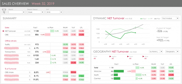
The key idea is to consolidate the main KPI drivers, which ultimately numbered 19, on the left, and present their dynamics and breakdown by key attributes on the right. The task seems straightforward, and the visualization logical and clear, until you dive into the details.
Detail 1. Data Volume
The main sales table for the year consists of about 300 million rows. Since we need to reflect dynamics compared to last year and the year before, the volume of data related to actual sales is about 1 billion rows. Additionally, information on planned data and online sales is stored separately. Therefore, even though we used the columnar in-memory DB SAP HANA, the query speed for selecting all metrics for one week from current storage on the fly was about 15-20 seconds. The solution to this problem is obvious – additional materialization of data. However, there are also pitfalls in this, which we will discuss below.
Detail 2. Non-additive Metrics
Many of our KPIs are tied to the number of receipts. This metric represents a COUNT DISTINCT of the number of rows (receipt headers) and shows different amounts depending on the selected attributes. For example, how this metric and its derivatives should be calculated:
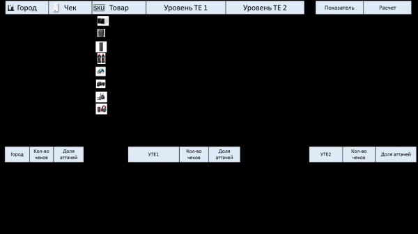
For the accuracy of calculations, you can:
- Perform calculations of such metrics on the fly in the storage;
- Perform calculations on the entire volume of data in Tableau, i.e., upon request in Tableau, return all data by selected filters at the granularity of receipt items;
- Create a materialized view that calculates all indicators for all sampling options, providing different non-additive results.
It is clear that in the example, UTE1 and UTE2 are material attributes representing the product hierarchy. This is not a static element; it facilitates management within the company, as different managers are responsible for different product groups. We have had many global reviews of this hierarchy when all levels changed, and when relationships were reassessed, along with constant targeted changes when one group moves from one node to another. In regular reporting, all of this is calculated on the fly from the material attributes; in the case of materializing this data, it is necessary to develop a mechanism for tracking such changes and automatically reloading historical data. This is quite a non-trivial task.
Detail 3. Data Comparison
This point is similar to the previous one. The essence is that in the company, when analyzing, it is customary to create several levels of comparison with the previous period:
Comparison with the previous period (day-to-day, week-to-week, month-to-month)
In this comparison, it is assumed that depending on the period chosen by the user (for example, the 33rd week of the year), we should show the dynamics compared to the 32nd week; if we selected data for a month, for instance, May, then this comparison would show the dynamics compared to April.
Comparison with the previous year
The main nuance here is that when comparing by days and weeks, you do not take the same day from the previous year, i.e., you cannot simply set the current year minus one. You need to look at the comparable day of the week. However, when comparing months, you should take the exact same calendar day from the previous year. There are also nuances with leap years. In the original repositories, all information is distributed by days; there are no separate fields for weeks, months, or years. Therefore, to obtain a complete analytical snapshot in the panel, you need to consider not just one period, for example, a week, but four weeks, and then this data must be compared to reflect dynamics and deviations. Accordingly, this logic for forming comparisons in dynamics can also be implemented either in Tableau or on the showcase side. Yes, we were aware of these details and considered them during the design phase, but forecasting their impact on the performance of the final dashboard was challenging.
During the implementation of the dashboard, we took a lengthy Agile approach. Our task was to provide a working tool with the necessary data for testing as quickly as possible. Therefore, we proceeded in sprints, focusing on minimizing work on the current repository side.
Part 1. Trust in Tableau
To simplify IT support and quickly implement changes, we decided to handle the logic for calculating non-additive indicators and comparing past periods in Tableau.
Stage 1. Everything in Live, no modifications to the showcases.
At this stage, we connected Tableau to the current showcases and decided to see how the number of receipts would be calculated for one year.
Result:
The answer was disheartening – 20 minutes. Data transfer over the network, high load on Tableau. We realized that the logic with non-additive indicators needed to be implemented on HANA. This did not scare us much; we already had similar experience with BO and Analysis, and we knew how to build fast showcases in HANA that correctly produce calculated non-additive indicators. Now we just needed to adjust them for Tableau.
Stage 2. We tune the showcases, no materialization, everything on the fly.
We created a separate new showcase that dynamically generated the required data for TABLEAU. Overall, we achieved a good result; we reduced the time to generate all metrics from one week to 9-10 seconds. Honestly, we expected that in Tableau, the dashboard response time would be 20-30 seconds on the first opening and then, due to caching, 10 to 12 seconds, which would be acceptable to us.
Result:
First dashboard opening: 4-5 minutes
Any click: 3-4 minutes
No one expected such an additional increase in the showcase's performance.
Part 2. Diving into Tableau
Stage 1. Performance analysis of Tableau and quick tuning
We started analyzing where Tableau spends most of its time. Fortunately, there are good tools for this, which is definitely a plus for Tableau. The main problem we identified was very complex SQL queries that Tableau constructed. These were primarily related to:
— data transposition. Since Tableau lacks tools for transposing datasets, to build the left side of the dashboard with a detailed view of all KPIs, we had to construct a table using a case statement. The size of the SQL queries in the database reached 120,000 characters.
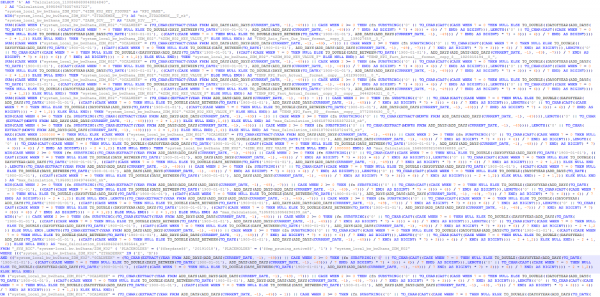
— time period selection. Such a query at the database level took more time to compile than to execute:

i.e., 12 seconds to process the query + 5 seconds to execute.
We decided to simplify the calculation logic on the Tableau side and move another part of the calculations to the showcase and database level. This brought good results.
Initially, we performed dynamic transposition via a full outer join at the final stage of VIEW calculation, according to the approach described on Wiki and .
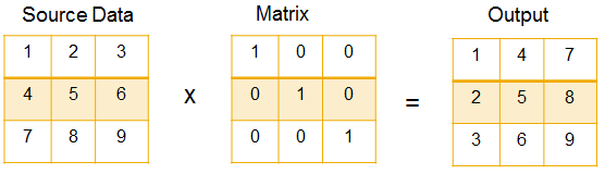
That is, we created a configuration table - a transposition matrix (21x21) and obtained all the metrics in a row-wise breakdown.
Previously:

Now:
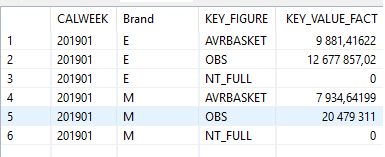
The database's self-transposition takes almost no time. The query for all metrics over the week still runs in about 10 seconds. However, the flexibility in building dashboards for specific metrics has been lost. Previously, the dashboard for the right section, showing dynamics and detailed breakdown of a specific metric, would run in 1-3 seconds as it queried a single metric. Now, the database always selects all metrics and filters the results before returning them to Tableau.
As a result, the dashboard's performance has decreased by almost three times.
Result:
- 5 sec — parsing the dashboard, visualizations
- 15-20 sec — preparation for query compilation with pre-calculations in Tableau
- 35-45 sec — compiling SQL queries and executing them in Hana either in parallel or sequentially
- 5 sec — processing results, sorting, recomputing visualizations in Tableau
- Naturally, such results were unsatisfactory for the business, and we continued optimizing.
Stage 2. Minimize logic in Tableau, full materialization
We understood that building a dashboard with a response time of a few seconds on a display that operates in 10 seconds is impossible, and we considered materializing data on the database side specifically for the required dashboard. However, we encountered a major issue as described above – non-additive metrics. We could not get Tableau to switch flexibly between different displays and levels, pre-calculated for various product hierarchies when filters or drill-downs were changed (in the example, three queries without UTE, with UTE1, and UTE2 generate different results). Thus, we decided to simplify the dashboard, abandon the product hierarchy in it, and see how fast it could be in a simplified version.
So, at this final stage, we assembled a separate storage where we placed all KPIs in a transposed format. On the database side, any query to such a storage executes in 0.1 – 0.3 seconds. In the dashboard, we achieved the following results:
First load: 8-10 seconds
Any click: 6-7 seconds
The time Tableau takes consists of:
- 0.3 sec — parsing the dashboard and compiling SQL queries
- 1.5-3 sec — executing SQL queries in Hana for the main visualizations (this runs in parallel with item 1)
- 1.5-2 seconds — rendering, recalculating visualizations
- 1.3 seconds — executing additional SQL queries to obtain relevant filter values (Brand, Division, City, Store), parsing results
To summarize briefly
We liked the Tableau tool in terms of visualization. During the prototyping stage, we explored various visualization elements and found all of them in the libraries, including complex multi-level segmentations and multi-driver waterfalls.
While implementing dashboards with key sales metrics, we encountered performance issues that we have yet to overcome. We spent more than two months and ended up with a functionally incomplete dashboard, whose response speed is on the edge of acceptable. We reached the following conclusions:
- Tableau cannot work with large volumes of data. If your source data model has more than 10 GB of data (approximately 200 million × 50 rows), the dashboard significantly slows down — from 10 seconds to several minutes for each click. We experimented with both live connections and extracts. The performance speed is comparable.
- Limitations when using multiple storage options (datasets). There’s no way to specify interrelationships between datasets using standard methods. If workaround solutions are used to connect datasets, it will significantly impact performance. In our case, we considered materializing data in each necessary view breakdown and making switches based on those materialized datasets while retaining previously selected filters — this turned out to be impossible in Tableau.
- In Tableau, it is impossible to create dynamic parameters. You cannot populate a parameter used for filtering a dataset in an extract or during a live connection with results from another dataset selection or the result of another SQL query; only native user input or a constant is allowed.
- Limitations related to building dashboards with OLAP|Pivot Table elements.
In MSTR, SAP SAC, SAP Analysis, when you add a dataset to a report, all objects are connected by default. In Tableau, this is not the case; you need to set up the connections manually. This might be more flexible, but it is a strict requirement for all our dashboards, which leads to additional labor costs. Moreover, if you're creating related filters, for example, to ensure that when filtering by region, the list of cities is limited to only those in that region, you'll immediately run into sequential queries to the database or extract, which noticeably slows down the dashboard. - Limitations in functions. Both for the extract and especially for the dataset from Live-connect, mass transformations cannot be performed. This can be done through Tableau Prep, but that entails additional labor costs and requires learning and maintaining another tool. For example, you can't transpose data or perform a self-join. This is restricted to transformations across individual columns or fields that need to be selected via case or if statements, resulting in very complex SQL queries where the database spends most of its time compiling the query text. These inflexibilities had to be addressed at the level of the data mart, which complicates storage, adds additional loads, and transformations.
We haven't given up on Tableau. However, as a tool capable of building industrial dashboards and serving as a means to replace and digitize the entire corporate reporting system of the company, we do not consider Tableau.
We are currently actively developing a similar dashboard on another tool while also trying to revise the architecture of the dashboard in Tableau to simplify it even further. If the community is interested, we’ll share the results.
We are also looking forward to your ideas or advice on how to build quick dashboards in Tableau with such large volumes of data, especially considering our site has much more data than retail.
Source: habr.com
