

A few words about the "golden section" in the traditional sense
It is believed that if the segment is divided into parts in such a way that its smaller part will refer to the larger one, as the larger one to the whole segment, then such a division gives the proportion 1 / 1,618, which the ancient Greeks, borrowing it from even more ancient Egyptians, called " golden ratio." And that many architectural structures - the ratio of the contours of buildings, the ratio between their key elements - from the Egyptian pyramids to the theoretical constructions of Le Corbusier - were based on this proportion.
It also corresponds to the Fibonacci numbers, the spiral of which gives a detailed geometric illustration of this proportion.
Moreover, the dimensions of the human body (from the soles to the navel, from the navel to the head, from the head to the fingers of a raised hand), starting from the ideal proportions seen in the Middle Ages (Vitruvian man, etc.), and ending with anthropometric measurements of the population of the USSR, are quite are close to this ratio.
And if we add that such figures were found in completely heterogeneous biological objects: mollusk shells, the arrangement of seeds in a sunflower and in cedar cones, then it is clear why an irrational number starting as 1,618 was declared "divine" - its traces can be traced even in the form of galaxies gravitating towards Fibonacci spirals!
Taking into account all the above examples, we can assume:
- we are dealing with truly “big data”,
- even in the first approximation, they indicate a certain, if not universality, then an unusually wide distribution of the "golden section" and values close to it.
In economics
Lorenz diagrams are widely known and intensively used to visualize the income of the population. These powerful macroeconomic tools with various variations and refinements (decile coefficient, Gini index) are used in statistics for the socio-economic comparison of countries and their characteristics and can be the rationale for making big political and budgetary decisions in the field of taxation, health care, development plans for countries and regions.
And although in a normal everyday consciousness, income and expenses are tightly interconnected, in Google this is not so ... It's amazing, but I managed to find a connection between Lorentz diagrams and the distribution of expenses only from two Russian authors (I would be grateful if someone knows similar works like in Russian and English-speaking sectors of the Internet).
The first is the dissertation of T. M. Bueva. The dissertation was devoted, in particular, to the optimization of costs at Mari poultry farms.
Another author, V.V. Matokhin (reciprocal references of the authors are available), approaches the matter on a larger scale. Matokhin, a physicist by his initial education, is engaged in statistical processing of data used in making managerial decisions, as well as assessing the adaptability and manageability of companies.
The concept and examples below are taken from the works of V. Matokhin and his colleagues (Matokhin, 1995), (Antoniou et al., 2002), (Kryanev, et al., 1998), (Matokhin et al. 2018). In this regard, it should be added that possible errors in the interpretation of their works are the exclusive property of the author of these lines and cannot be attributed to the original academic texts.
Unexpected persistence
Reflected in the graphs below.
1. Distribution of grants for the competition of scientific and technical works under the State program “High-temperature superconductivity”. (Matokhin, 1995)
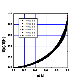
Fig.1. Proportions in the annual allocation of funds to projects in 1988-1994.
The main characteristics of annual distributions are given in Table 3, where SN is the annual amount of funds distributed (in million rubles), and N is the number of projects financed. Taking into account the fact that over the years the personal composition of the jury of the competition, the budget of the competition and even the scale of money (before the reform of 1991 and after) have changed, the stability of real curves over time is amazing. The black bar on the graph is made up of experimental points.
| 1988 | 1989 | 1990 | 1991 | 1992 | 1993 | 1994 | ||
| S | 273 | 362 | 432 | 553 | 345 | 353 | 253 | X |
| Sn | 143.1 | 137.6 | 136.9 | 411.2 | 109.4 | 920 | 977 | Y |
Table 3
2. Curve of costs associated with the sale of inventory (Kotlyar, 1989)
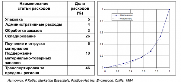
Ris.2
3. Tariff scale of salaries to ranks
As an example, for constructing a diagram, data were taken from the document “Vedomosti: how many ranks in the states of an ordinary annual salary per year are supposed to have” (Suvorov, 2014) (“Science to win”).
| 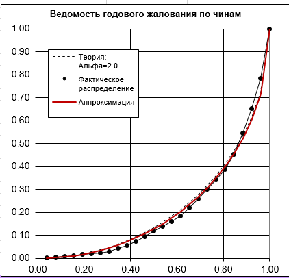 Rice. 3. Diagram of proportionality of annual salaries by rank |
4. The average work schedule of an American middle manager (Mintzberg, 1973)
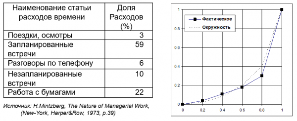
Ris.4
The above normalized graphs suggest that there is a general pattern in the economic activities illustrated by them. With a radical difference in the specifics of economic activity, in its place and time, it is very likely that the similarity of the schedules is dictated by some fundamental condition for the functioning of economic systems. It is only after millennia of doing business, based on a huge number of trials and errors, that the subjects of this activity have found some optimal strategy for allocating resources. And intuitively use it in the current activity. This assumption is in good agreement with the well-known Pareto principle: 20% of our efforts give 80% of the results. There is clearly something similar here. The above graphs express an empirical regularity, which, in the case of transformation into a Lorentz diagram, is described with sufficient accuracy with an exponent "alpha" equal to 2. With this exponent, the Lorentz diagram turns into a part of a circle.
You can call this characteristic, which does not yet have a stable name, survival. By analogy with survival in the wild, the survival of an economic system is determined by its accumulated adaptation to the conditions of the socio-economic environment and the ability to adapt to changes in market conditions.
This means that a system in which the distribution of costs is close to ideal (with an exponent of "alpha" equal to 2, or a distribution of costs "on a circle"), has the greatest chance of remaining in its current form. It is noteworthy that in some cases such a distribution determines the highest profitability of the enterprise. For example, here. The smaller the coefficient of deviation from the ideal, the higher the profitability of the enterprise (Bueva, 2002).
Table (fragment)
| Name of farm, district | Profitability (%) | Rejection coefficient | |
| 1 | SUE p / f "Volzhskaya" Volzhsky district | 13,0 | 0,336 |
| 2 | SPK p / f "Gornomariyskaya" | 11,1 | 0,18 |
| 3 | UMSP s-z "Zvenigovsky" | 33,7 | 0,068 |
| 4 | CJSC "Mariyskoye" Medvedevskiy district | 7,5 | 0,195 |
| 5 | JSC Teplichnoye, Medvedevsky district | 16,3 | 0,107 |
| ... | |||
| 47 | SPK (k-z) "Dawn" of the Soviet district | 3,2 | 0,303 |
| 48 | S-z "Bronevik" Kilemarsky district | 14,2 | 0,117 |
| 49 | SPK SHA "Avangard" Morkinsky district | 6,5 | 0,261 |
| 50 | SHA to them. Petrova, Morkinsky district | 22,5 | 0,135 |
Practical Conclusions
When planning expenses, both for a company and for a household, it is useful to build a Lorenz curve on them and compare it with the ideal one. The closer your diagram is to perfection, the more likely you are to plan correctly and that your activity will be successful. Such proximity confirms that your plans are close to the experience of human economic activity, deposited in such generally recognized empirical patterns as the Pareto principle.
However, we can assume that here we are talking about the functioning of a mature economic system focused on profitability. If it is not about profit maximization, but, for example, about the task of modernizing the company or fundamentally increasing its market share, your cost distribution curve will move away from the circle.
It is clear that in the case of a start-up with its specific economy, the Lorentz diagram, which corresponds to the highest probability of success, will also deviate from the circle. It can be hypothesized that the deviation of the cost distribution curve inside the circle corresponds to both increased risks and reduced adaptability of the company. However, without relying on large statistical arrays of start-ups (both successful and unsuccessful), reasonable qualified forecasts are hardly possible.
According to another hypothesis, the outward deviation of the cost distribution curve from the circle can be a signal of both excessive regulation of management and a signal of impending bankruptcy. To test this hypothesis, a certain reference base is also needed, which, as in the case of start-ups, is unlikely to exist in the public domain.
Instead of a conclusion
The first major publications on this topic date back to 1995 (Matokhin, 1995). And the little knownness of these works, with their universality and radically new use of models and tools widely used by economists, remains in a sense a mystery ...
Source: habr.com
